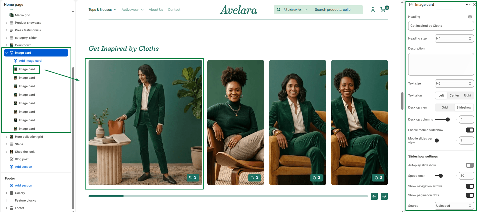
The Image Card section allows merchants to showcase multiple promotional image blocks in either a standard grid layout or an interactive slideshow layout. Each card can display an image, a notification badge, title, description, and call-to-action button. This section is ideal for highlighting featured categories, collections, or brand stories.
Section settings
-
- Color scheme: Controls the overall background and text color of the section.
- Section width: Choose whether the content is constrained to
Pagewidth or spansFullwidth edge-to-edge. - Heading & size: Add a main heading for the section and select its size (H1-H6).
- Description & Text size: Add optional text that appears under the heading and control its size.
- Text align: Align the heading and description to the
Left,Center, orRight. - Desktop layout:
- Desktop view: Choose between two display modes for desktop:
Grid(displays cards in multiple rows) orSlideshow(displays cards in a swipeable horizontal slider). - Desktop columns: Select how many cards to show per row on desktop (from 1 to 6).
- Desktop view: Choose between two display modes for desktop:
- Mobile layout:
- Enable mobile slideshow: Converts the grid into a slideshow mode on mobile devices (highly recommended to save vertical space).
- Mobile slides per view: Set how many slides appear side-by-side on mobile screens (1 to 3).
- Slideshow settings: If you selected ‘Slideshow’ for either desktop or mobile, you can customize:
- Autoplay slideshow: Automatically cycle through the cards.
- Slideshow speed: Set the slide transition interval.
- Show navigation: Display left and right arrows for manual slide navigation.
- Show pagination: Display a progress bar below the slider.
- Top padding / Bottom padding: Adjust the vertical spacing above and below the section.