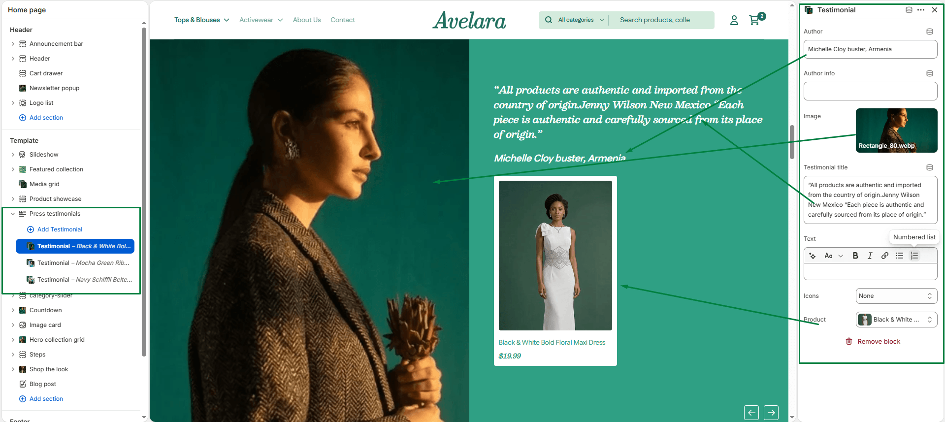
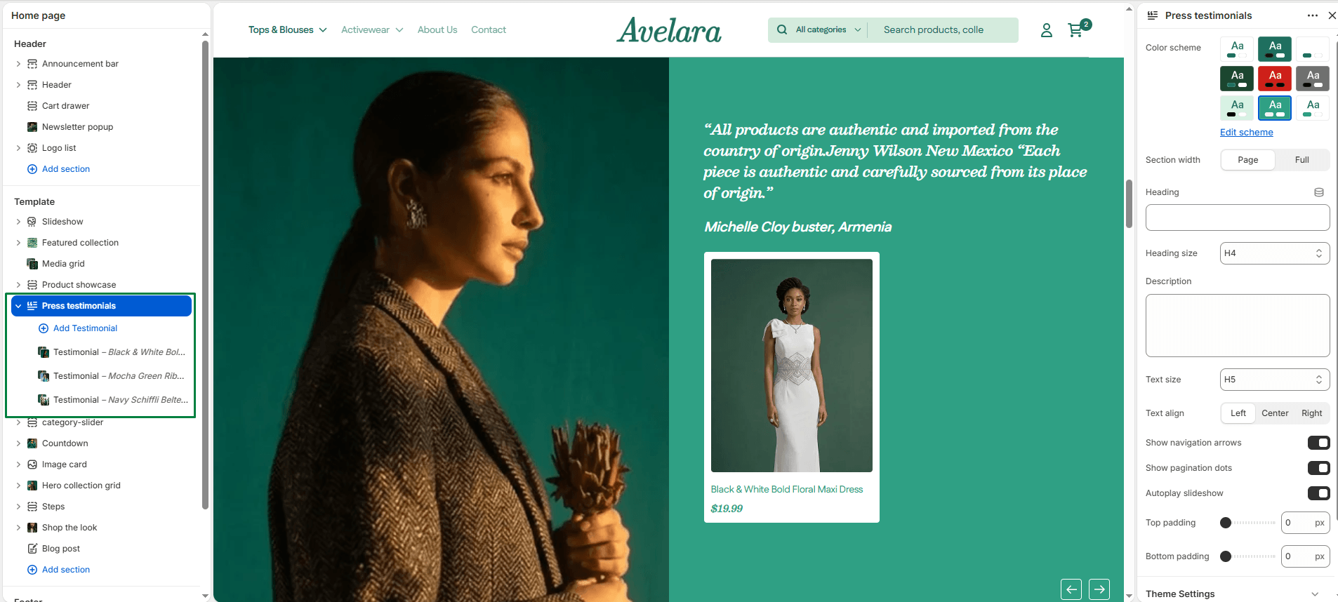
The Press testimonials section is an elegant slider designed to build social proof. It displays a large image on one side (which could be the product, the customer, or a press logo) and the review text, rating, and author details on the other. It even allows you to link the specific product being reviewed directly inside the testimonial card.
Section settings
-
- Color scheme: Select your preferred color palette for the section background and text.
- Section width: Choose how wide the section appears:
Page(constrained) orFull(edge-to-edge). - Header:
- Heading & Size: Add a main title for the section (e.g., “Testimonials”) and choose the heading tag.
- Description & Text size: Add a short introductory paragraph and adjust its size.
- Text align: Align the section header text to the
Left,Center, orRight.
- Slider Settings:
- Show navigation: Toggle ON to display arrow controls for manual sliding.
- Show pagination: Toggle ON to display a progress bar indicator below the slider.
- Autoplay: Toggle ON to automatically rotate the testimonials without user interaction.
- Top padding / Bottom padding: Adjust vertical spacing (in pixels) above and below the section.
Blocks: Testimonial
Each block represents an individual review or press mention.
-
- Author: Enter the name of the person or publication giving the review.
- Author info: Add a subtitle, like their job title or location (e.g., “Verified Buyer”).
- Image: Upload a large lifestyle image, a customer photo, or a press publication logo to display next to the review.
- Testimonial title: Enter a bold headline summarizing the review.
- Testimonial: Enter the full review or quote.
- Icon: Select a visual icon to display above the text. Options include a quote icon, or star ratings (from 1 to 5 stars).
- Product: Select the specific product being reviewed. This will display a mini product card (with image, title, and price) directly inside the testimonial layout, allowing customers to easily click through and purchase.