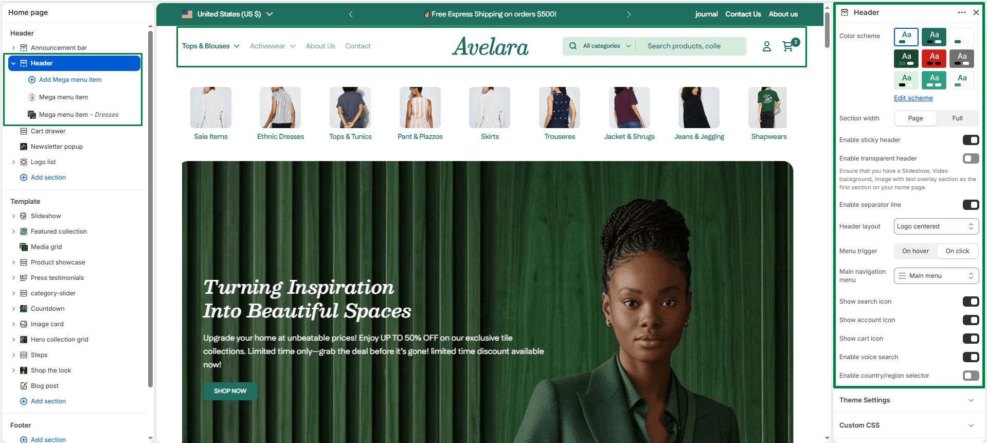
The Header section appears at the top of every page and provides key navigation and store utilities. It helps users explore your store, find products, and access their account seamlessly.
Navigate to Sections > Header to customize the following settings:
-
- Color scheme: Select the color scheme to control text, background, and icon colors. This helps the header blend with or contrast your store’s design.
- Section width: Choose how wide the header spans on the page:
page-width(aligns with the site’s content width) orfull-width(stretches across the full viewport width). - Enable sticky header: Keeps the header visible at the top of the screen while the user scrolls down, ensuring navigation and cart access remain always available.
- Enable transparent header: Makes the header background transparent, typically used over hero banners or slideshows. (Tip: Ensure your first homepage section is a banner or slideshow for the best appearance).
- Enable separator line: Adds a thin dividing line below the header for visual separation from the page content.
- Header layout: Choose the arrangement of your logo and navigation. Options include: Logo centered, Logo left, Logo top (with menu below), or a Drawer style menu.
- Menu trigger: Determines how dropdowns open: On hover (opens when hovering over menu items) or On click (opens when clicking the item).
- Main navigation menu: Select which navigation menu to display in the header. (This is managed under Online Store > Navigation in your Shopify admin).
- Show search icon: Displays a magnifying glass icon, allowing customers to search your store directly from the header.
- Show account icon: Shows the customer account icon, giving quick access to login, register, or account pages.
- Show cart icon: Enables the cart icon in the header, allowing customers to view or open their cart drawer.
- Enable voice search: Adds a microphone icon for voice-based product searching (if supported by the user’s browser/device).
- Enable language & country selector: Displays Shopify’s native localization selectors directly in your header for international customers.
Blocks
-
- Mega Menu Item: This block allows you to create rich, multi-column dropdown menus under your main header navigation. It supports multiple layout types, giving you the flexibility to showcase featured products, promotions, or editorial content directly in the navigation.
- Menu item handle: Enter the exact name of the top-level menu item that this mega menu belongs to (e.g.,
CollectionsorShop). This links the block to its corresponding navigation item. - Item type: Choose the layout style for this mega menu. Available types include: Multiple images, Multiple pages, Products, Multiple collections, Blogs, Custom content, and Collection Tabs.
- Section title: Optional title text displayed at the top of the mega menu for visual grouping or branding.
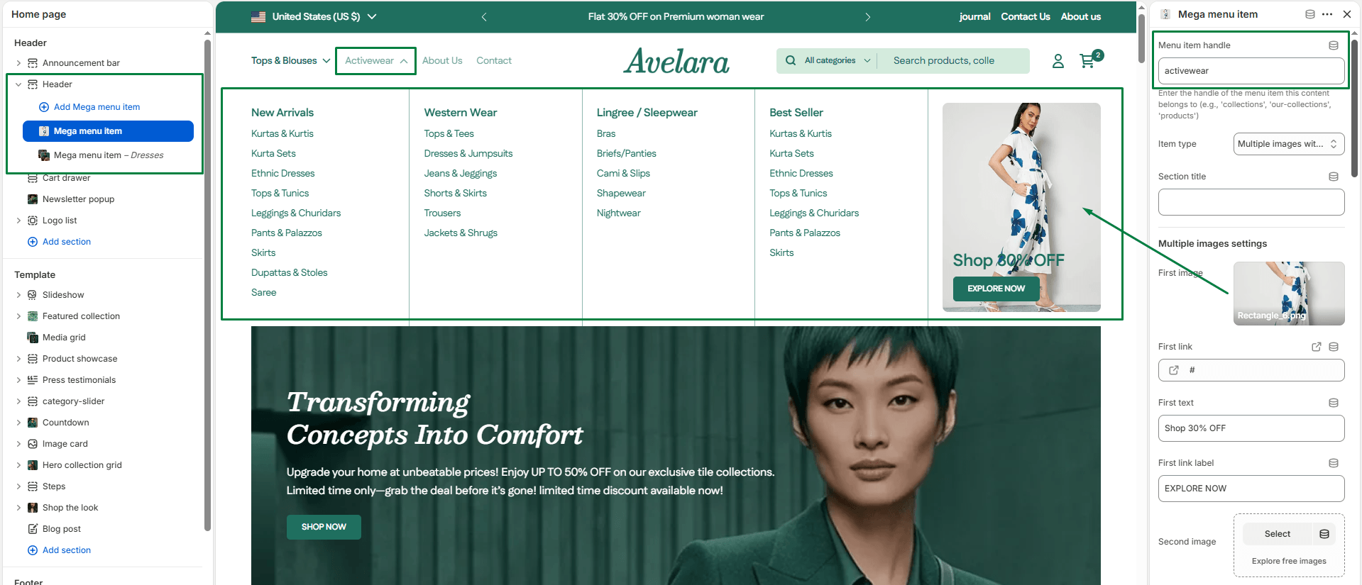
- Multiple Images Settings: Upload up to 4 images. For each image, you can set the Link, Overlay Text, and a Link Label (e.g., a “Shop Now” button text).
- Multiple Pages Settings: Select up to 4 pages to feature. Useful for linking to About, Contact, FAQs, or Policy pages.
- Products Settings: Choose a collection and use the slider to select how many products (up to 8) to display directly in the dropdown.
- Multiple Collections Settings: Select up to 4 different collections to feature. Each appears with its name and thumbnail.
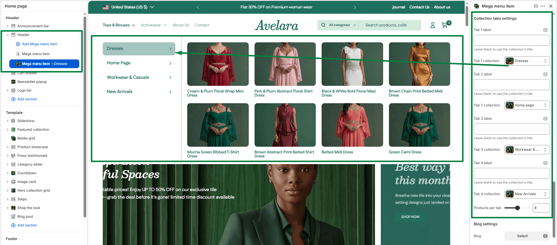
- Collection Tabs Settings: Create a tabbed browsing experience inside the mega menu. You can define up to 4 tabs, assigning a Label and a Collection to each, plus a product limit.
- Blog Settings: Feature recent or popular blog posts. Choose the blog and set how many recent posts to display.
- Menu item handle: Enter the exact name of the top-level menu item that this mega menu belongs to (e.g.,
- Mega Menu Item: This block allows you to create rich, multi-column dropdown menus under your main header navigation. It supports multiple layout types, giving you the flexibility to showcase featured products, promotions, or editorial content directly in the navigation.
1. Multiple Images Upload to images with text overlays and links.
2. Collection Tabs Create a tabbed browsing experience inside the mega menu.