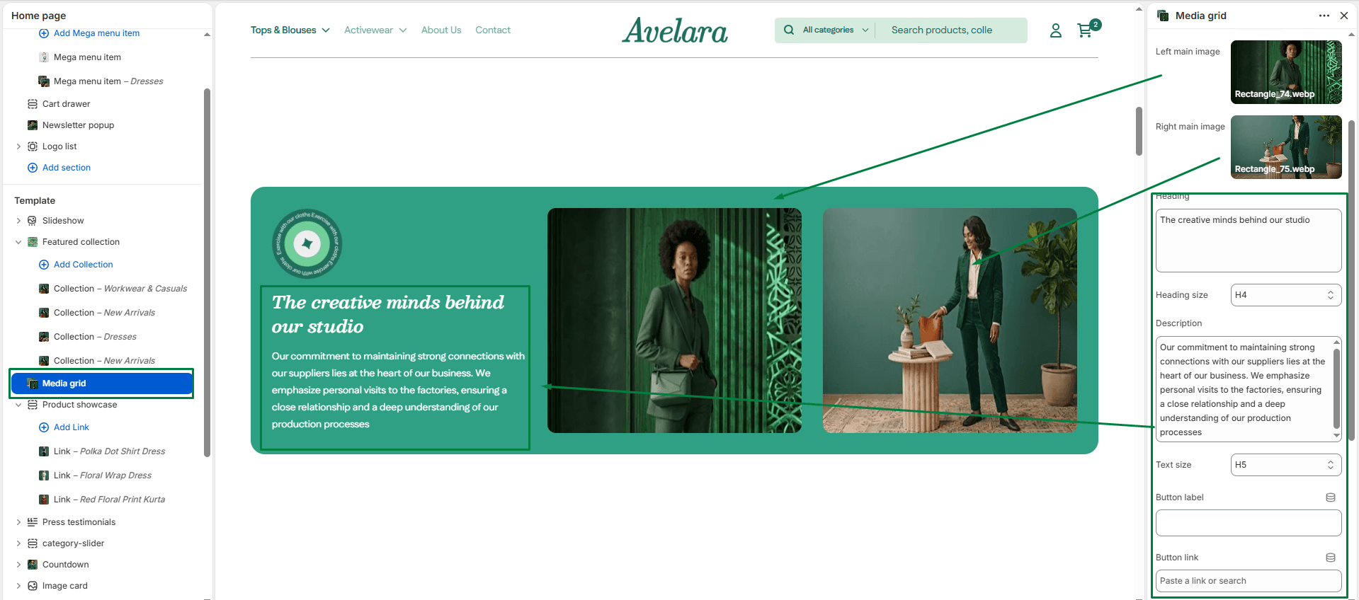
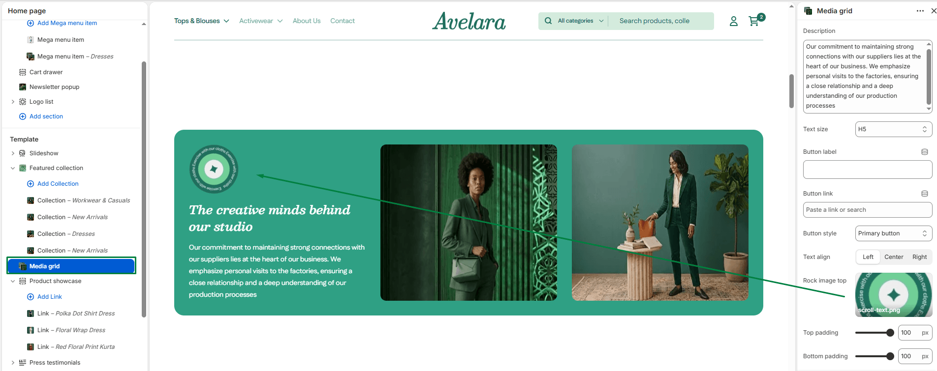
The Media Grid is a high-end storytelling section that uses an asymmetrical layout to showcase lifestyle imagery. It features two primary large images and a floating decorative graphic (like a rock or stone) to create a sense of depth and luxury.
Section settings
-
- Color scheme: Select your preferred color palette for the background and text.
- Section width: Choose whether the content is constrained to
Pagewidth or stretches toFullwidth edge-to-edge. - Images:
- Main image left: The large, vertical image displayed on the left side of the layout.
- Main image right: The large, horizontal image displayed on the right side of the layout.
- Rock image top: A decorative floating element placed near the top-right of the text area. Upload a transparent PNG for the best effect.
- Text content:
- Heading & size: Enter the main title for the section (supports multi-line text) and select its size (H1-H6).
- Description & Text size: Add a secondary paragraph of text below the heading and select its size.
- Text align: Set the alignment of the text and button (
Left,Center, orRight).
- Button:
- Button label: Enter the text (e.g., “Shop Now”) to display a call-to-action button.
- Button link: Paste a URL or select a destination from your store.
- Button style: Choose between the available styles (
PrimaryorSecondary).
- Top padding / Bottom padding: Adjust the vertical spacing (in pixels) above and below the section to give the grid room to breathe.