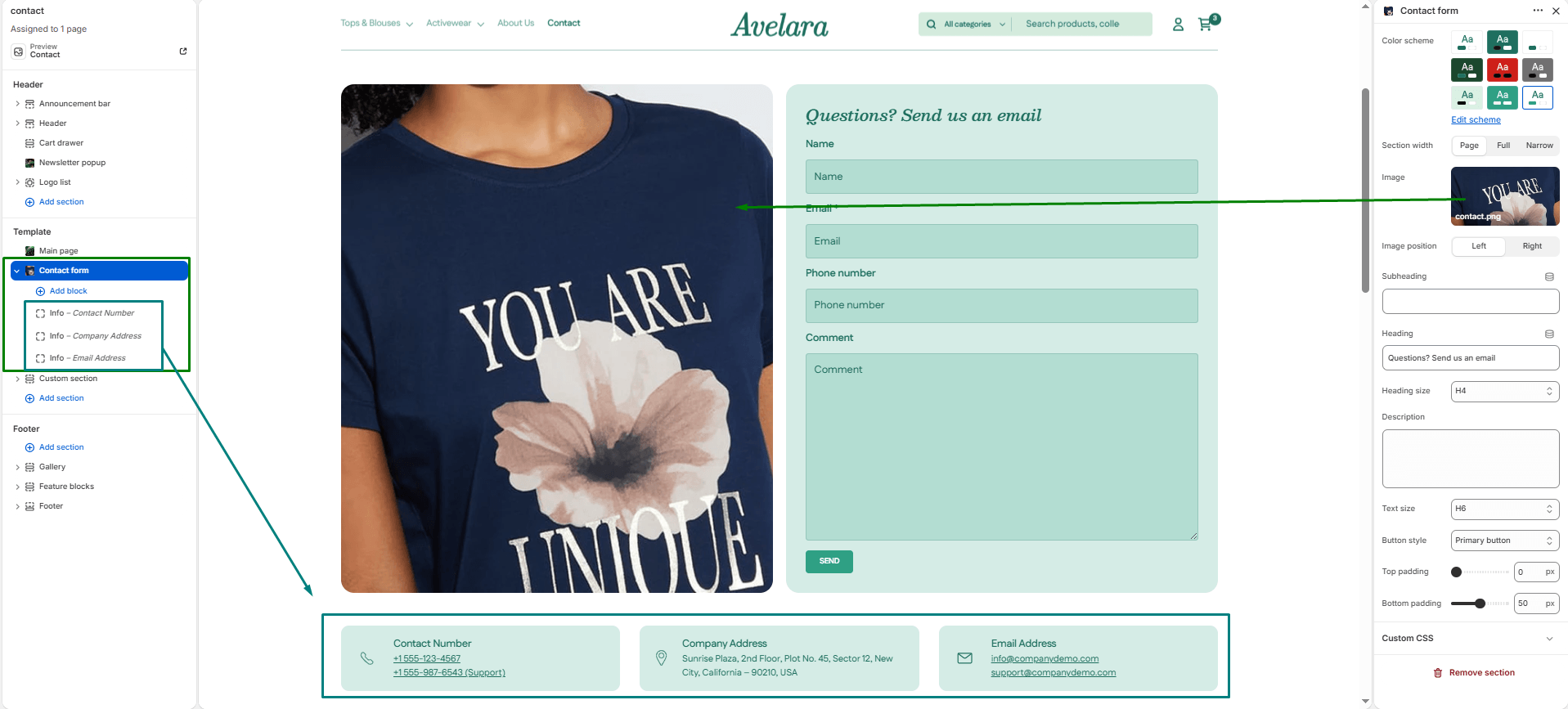
The Contact form section allows customers to reach out directly through your website. It includes customizable text content, contact fields, and optional info blocks to build a comprehensive, trustworthy contact page.
Section settings
-
- Color scheme: Choose a predefined color style to match your theme’s design.
- Section width: Controls the layout width. Options:
Page(standard width),Full(edge-to-edge), orNarrow(centered and compact). - Image: Upload a large image to display beside the contact form (perfect for brand or lifestyle imagery). If left blank, the form will automatically expand to full width.
- Image position: If using an image, choose whether it sits on the
LeftorRightside of the form. - Subheading: Add a short introductory text above the main heading (e.g., “Get in Touch”).
- Heading & size: Set the main title for the section (e.g., “Let’s Chat”) and control its heading size (H1-H6).
- Description & Text size: Add a supporting paragraph explaining your response times or alternative contact methods, and adjust its text size.
- Button style: Select the visual style (
PrimaryorSecondary) for the form’s “Send” button. - Top padding / Bottom padding: Add vertical spacing (in pixels) above and below the section content.
Blocks
In addition to the main form, you can add blocks that appear below the form as distinct detail cards.
-
- Heading block: Adds a standalone title (e.g., “Our Offices”) to break up information.
- Info block: Adds a contact detail card (useful for listing phone numbers, emails, or physical addresses).
- Icon: Select a predefined icon from the dropdown (e.g., Phone, Envelope, Location Pin).
- Custom Icon Image: Alternatively, upload your own custom icon image if you prefer not to use the predefined icons.
- Heading: The title of the contact method (e.g., “Call Us”).
- Text: The actual contact detail (e.g., “+1 (800) 123-4567”).