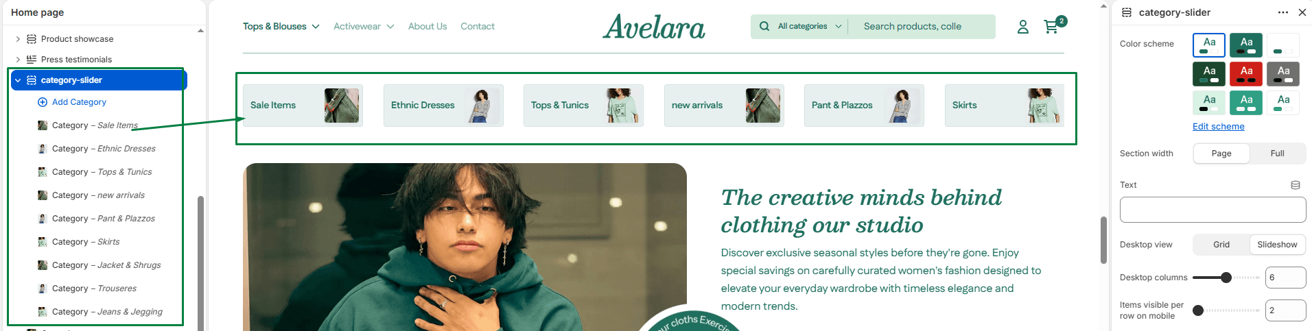
The Category slider section displays a row of compact category cards. Each card contains a small thumbnail image and a title, making it extremely useful for quick navigation just below your homepage hero banner or at the top of collection pages.
Section settings
-
- Color scheme: Select the color palette for the background and text of the section.
- Section width: Choose whether the section is constrained to
Pagewidth or stretches toFullwidth across the browser. - Title: Add a main heading above the category slider (e.g., “Shop by Category”).
- Desktop view: Choose how the category cards display on desktop screens:
- Grid: Displays the categories in a wrap-around grid layout (showing them all at once).
- Slideshow: Displays the categories in a horizontal carousel that users can drag or swipe.
- Desktop columns: Define how many category cards are displayed per row on desktop (from 2 up to 10 columns).
- Mobile columns: Define how many category cards are displayed per row on mobile screens (from 2 up to 5 columns).
- Top padding / Bottom padding: Adjust vertical spacing (in pixels) above and below the section.
Blocks: Category
You can add multiple Category blocks to populate this section.
-
- Image: Upload a small square thumbnail image to represent the category.
- Title: Enter the name of the category (e.g., “Sale Items”, “Tops”).
- Link: Select the destination URL for the category.