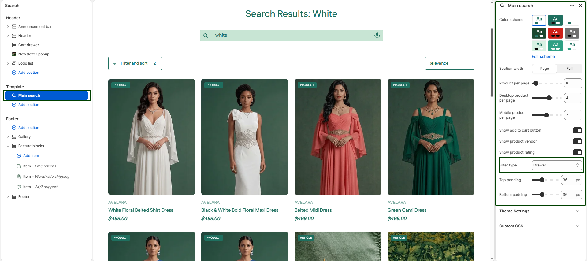
The Main Search section powers the product search results page in your Shopify theme. It displays relevant products based on customer search queries, along with advanced filtering and pagination options.
This section is fully responsive and designed to provide a smooth, intuitive shopping experience for customers searching across all your products, articles, and pages.
Navigate to Sections > Main search (you may need to search for something on your store to view this page in the Theme Editor) to customize these settings:
-
- Color scheme: Choose the visual theme for the search results page.
- Section width: Defines how wide the content spans within the layout:
page-width(constrained) orfull-width(spans the entire screen). - Product per page: Controls the total number of products displayed on a single page before pagination kicks in.
- Desktop products per row: Use the slider to set the number of products shown per row on desktop devices (1 to 6).
- Mobile products per row: Use the slider to set the number of products shown per row on mobile devices (1 to 3).
- Show ‘Add to cart’ button: Enable this to display a quick add-to-cart button directly on the search result product cards.
- Show vendor: Displays the product’s vendor/brand name above the product title on the card.
- Show product rating: Displays the product’s star rating (requires a compatible product reviews app).
- Filter type: Determines how your collection filters appear and function on the page.
- Vertical: Filters are displayed permanently on the left side of the product grid.
- Horizontal: Filters are displayed in a horizontal bar above the grid.
- Drawer: Filters slide out from the side of the screen when a ‘Filter’ button is clicked (great for clean, modern layouts).
- Top & Bottom padding: Adjust the vertical spacing (in pixels) above and below the search results section.