The Product showcase section is a highly interactive, dynamic layout perfect for highlighting key products or “Hero” collections. It features a list of clickable product titles on one side; when a user hovers over (or taps) a title, beautiful lifestyle images from that product automatically appear and transition on the opposite side of the screen.
Section settings
-
- Color scheme: Select a color palette for the background and text to match your brand style.
- Section width: Choose whether the section is constrained to
Pagewidth or stretches toFullwidth across the browser. - Main Header:
- Heading & Size: Add a primary title above the showcase (e.g., “Featured collection title”) and set its size (H1-H6).
- Description & Text size: Add an introductory paragraph below the product links and select its font size.
- Button:
- Button label: Enter the text for a global call-to-action button (e.g., “Shop Woman Wear”).
- Button link: Add the destination URL for this button.
- Button style: Select the visual style of the button (
PrimaryorSecondary).
- Top padding / Bottom padding: Adjust the vertical spacing (in pixels) above and below the section.
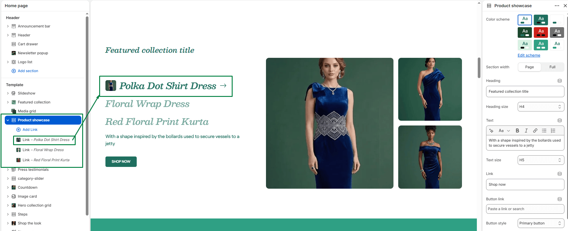
Blocks: Link
You can add up to 4 Link blocks. Each block represents a single interactive product entry in the list.
-
- Title: Enter the display text for the link. This overrides the product’s actual title if provided.
- Link: Optionally provide a custom URL. If left blank, it defaults to the product’s URL.
- Product: Select the specific product to showcase. The section will automatically pull this product’s featured image for the small thumbnail icon next to the link, and use up to 3 of its media images for the large interactive display on the right side.


