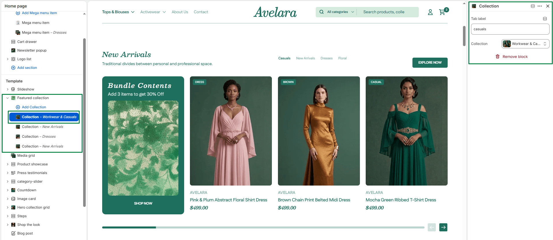
The Featured Collection section promotes key products from specific Shopify collections. It supports a multi-tab layout, allowing you to showcase multiple collections in one place (e.g., “Bestsellers”, “New Arrivals”, “Sale”). It also supports both grid and slider layouts and includes a special Promo Banner feature.
Section settings
-
- Color scheme: Applies your chosen theme color scheme to section backgrounds and text.
- Section width: Choose how wide the section spans on the page (
PageorFullwidth). - Heading & size: Title displayed at the top of the section, and its size (H1-H6).
- Description & Text size: Optional text displayed under the main heading, and its size.
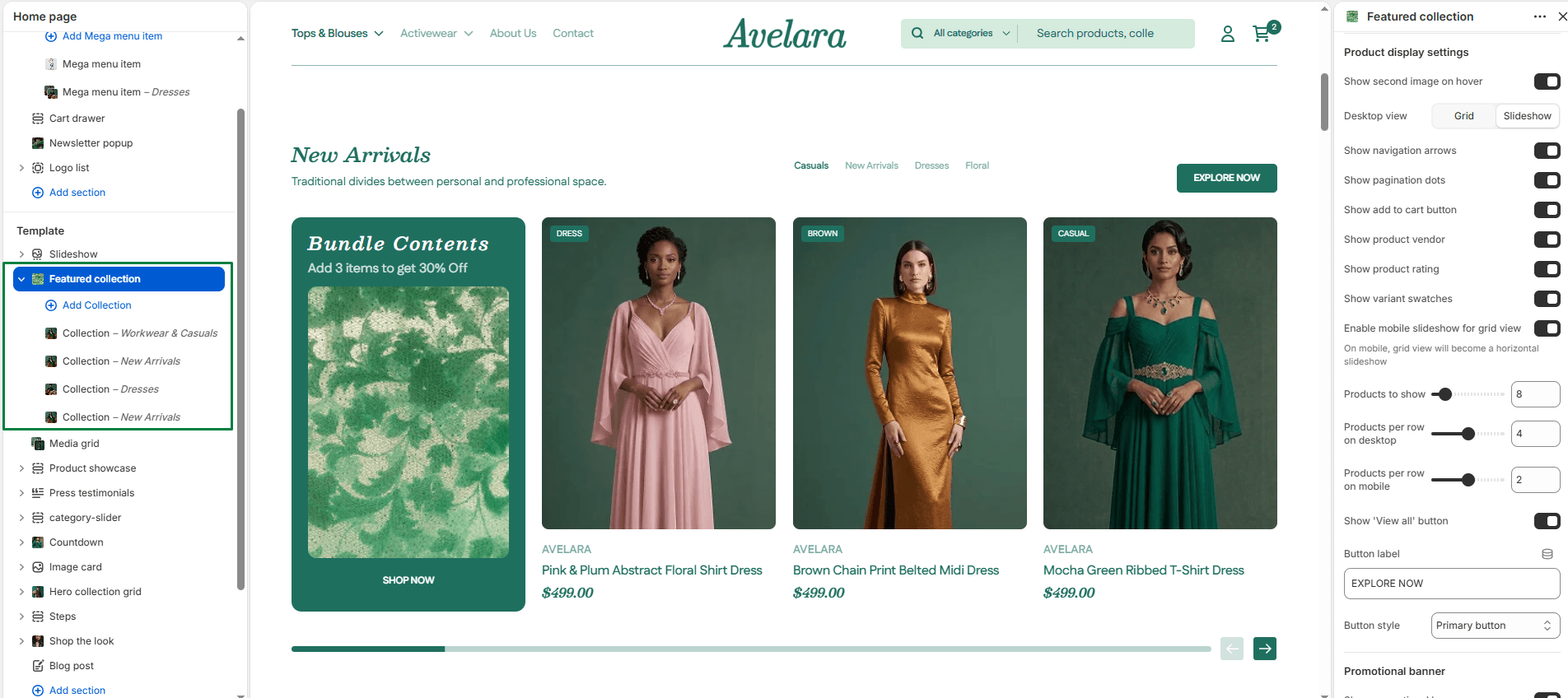
Product display settings
-
- Desktop layout:
- Desktop view: Choose how products appear on desktop:
Grid(static layout) orSlideshow(scrollable carousel). - Products per row: Set how many products to display per row (from 2 to 6).
- Desktop view: Choose how products appear on desktop:
- Mobile layout:
- Enable mobile slideshow (for grid view): When enabled, it converts the static product grid into a swipeable slider on mobile devices for better usability.
- Products per row: Set how many products to display per row on smaller screens (1 to 3).
- Slideshow settings: If using a slideshow layout, you can toggle Show navigation (arrows) and Show pagination (dots).
- Product limit: Define the total number of products to display from the collection (up to 50).
- Product card options:
- Show secondary image on hover: Enables a secondary product image to appear when hovering over the product card.
- Show add to cart button: Adds a quick-buy button beneath product cards.
- Show product vendor: Displays the product’s brand name below the title.
- Show product rating: Displays product star ratings.
- Show variant swatches: Shows available variants as color swatches or buttons.
- View All button:
- Show “View all” button: Toggle to show or hide a button linking to the full collection page.
- Button label & style: Customize the button’s text (e.g., “See all products”) and visual style (
PrimaryorSecondary).
- Desktop layout:
Promo banner settings
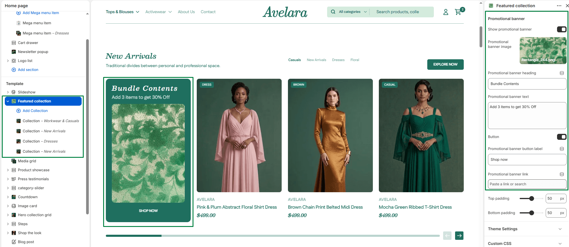
The Promo Banner is a special slide that gets inserted into your Featured Collection to grab attention (e.g., “Summer Sale – 20% Off!”).
-
- Show promo banner: Toggle ON to enable the banner.
- Promo banner image: Upload the background image for the banner.
- Promo banner heading & text: Add a bold title and supporting description.
- Promo button: Toggle Show button, set the Button label, and attach a Link (e.g., to a clearance page).
Spacing
-
- Top padding / Bottom padding: Adds spacing above and below the section for layout balance.
Blocks: Collection tab
Instead of a single collection setting, this section uses Blocks to build a tabbed navigation interface. You must add at least one block to display products. If you only add one block, it just acts as a standard featured collection.
-
- Tab label: The name that appears on the tab button (e.g., “Trending Now”). If left blank, it will default to the collection’s name.
- Collection: Select the specific collection of products to display when this tab is clicked.