The Feature blocks section is a fantastic way to quickly communicate your store’s core benefits, guarantees, or value propositions (e.g., “Free Shipping”, “30-Day Returns”, “Secure Checkout”). Placing these strategically on your homepage or product pages builds immediate trust with your customers.
Navigate to Sections > Feature blocks to customize these settings:
-
- Color scheme: Select a predefined color palette to match your theme.
- Section Width: Choose how wide the section spans:
page-width(constrained to the main content area) orfull-width(edge-to-edge). - Heading & Size: Optionally add a section title to introduce your features, and select the heading size (H1-H6).
- Description & Size: Add supporting text below the main heading and control its font size (H1-H6).
- Desktop view: Choose how the blocks are displayed on desktop screens. You can select
grid(to show them all at once) orslideshow(to let users scroll through them horizontally if you have many). - Top & Bottom padding: Adjust the vertical spacing (in pixels) above and below the section.
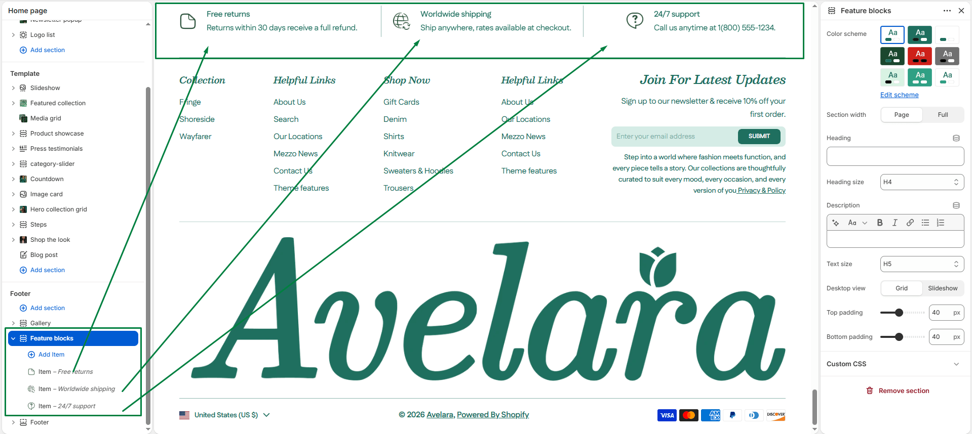
Blocks
-
- Feature Item: You can add up to 6 individual feature blocks. Each block represents one core benefit.
- Image: Upload a small icon or image (e.g., a shipping truck icon or a security badge).
- Title: Enter the main benefit as a short, punchy headline (e.g., “Free Shipping”).
- Description: Add a short subtext explaining the benefit (e.g., “On all orders above $50”).
- Text Align: Choose how the text vertically aligns next to the icon (Start, Middle, or End).
- Feature Item: You can add up to 6 individual feature blocks. Each block represents one core benefit.


