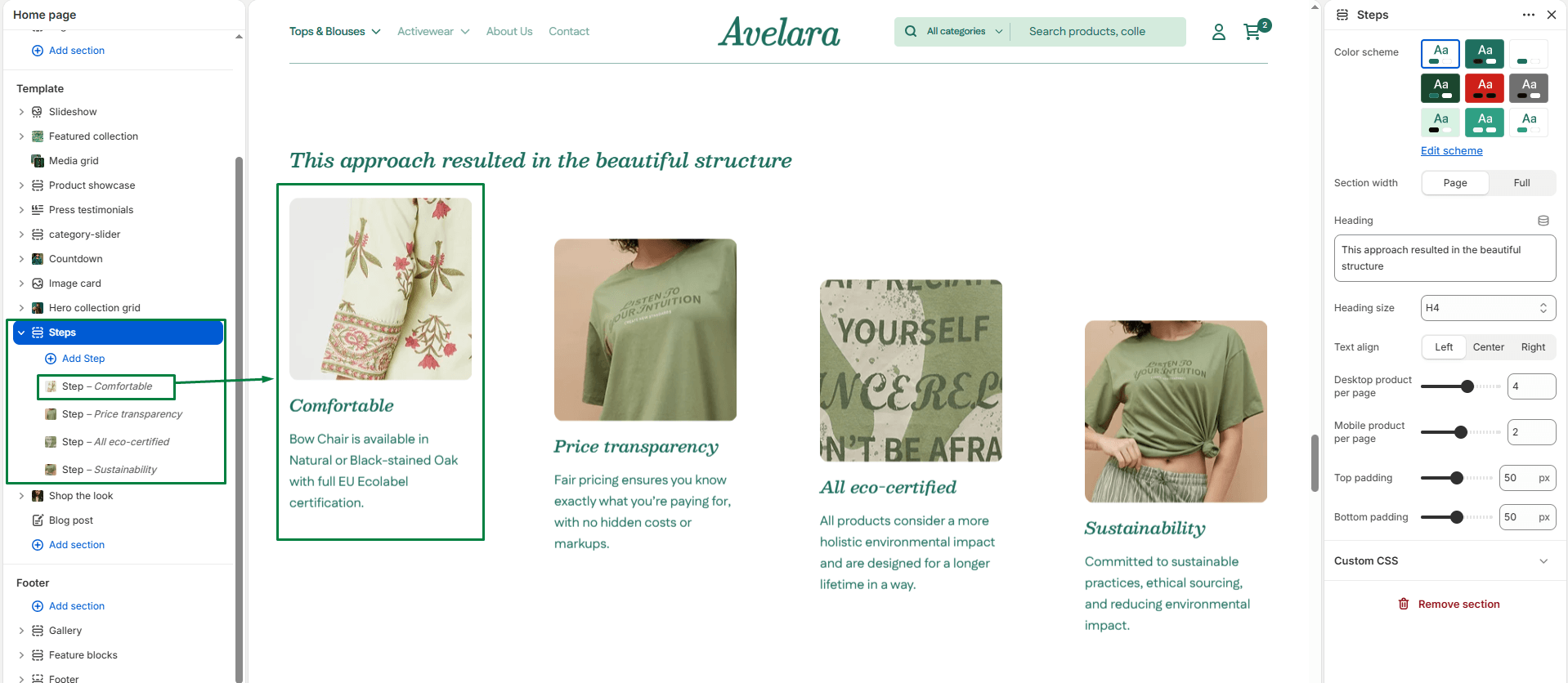
The Steps section is a structured grid layout designed to explain processes, company values, or “Why Choose Us” features using images and text. It’s a fantastic way to visually break down information like how a product is made or how your service works.
Section settings
-
- Color scheme: Choose the color scheme that matches your site design. This affects the text and background colors for the entire section.
- Section width: Choose whether the section is constrained to
Pagewidth or stretches toFullwidth across the browser. - Heading & Size: Add a main heading for the section (e.g., “How it works”) and select its size (H1-H6).
- Text Align: Controls the horizontal alignment of the main section heading (
Left,Center, orRight). - Grid Layout:
- Desktop products per row: Controls how many columns (steps) are displayed side-by-side on desktop screens (1 to 6).
- Mobile products per row: Controls how many columns (steps) are displayed side-by-side on mobile screens (1 to 3).
- Top padding / Bottom padding: Adjust the vertical spacing (in pixels) above and below the section.
Blocks: Step
Each “Step” block represents a single column within the section. You can add multiple step blocks to build out your grid.
-
- Image: Upload a visual representation (photo or illustration) for that specific step.
- Heading & Size: The name or number of the step, along with its visual size.
- Text & Text size: The main paragraph or supporting text under the heading, along with its visual size.
- Text Align: Controls the alignment of the text specifically for this step block (
Left,Center, orRight). - Link: Choose the destination URL (e.g., a page or collection) if you want this step to be actionable.
- Button label: Enter the call-to-action text for the button (e.g., “Learn More”).
- Button style: Determines the design of the button (
PrimaryorSecondary).