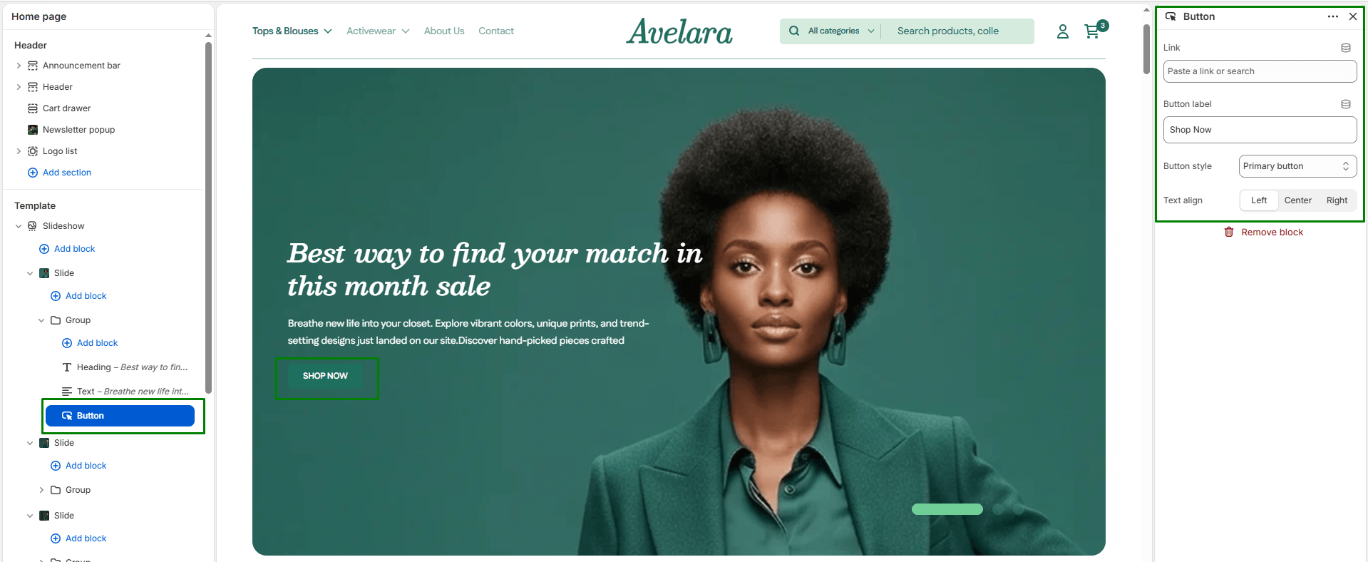
The Button block adds a customizable call-to-action (CTA) inside a section. It allows you to link directly to any page, collection, or product, with full control over the button’s text, alignment, and style. This block is commonly used in hero sections, image banners, and promotional areas to direct customers toward important areas of your store.
Block Settings
-
- Link: Select or paste a link to a product, collection, or page. This determines where the customer is redirected when the button is clicked.
- Button label: The visible text displayed on the button (e.g., “Explore All Products” or “Shop Now”).
- Button style: Choose the visual design of the button based on your global theme settings. Options include:
- Primary button: Uses your main accent color, ideal for the most important action.
- Secondary button: Typically an outlined or lighter button for alternative actions.
- Text align: Sets the horizontal alignment of the button within the content area (
Left,Center, orRight).