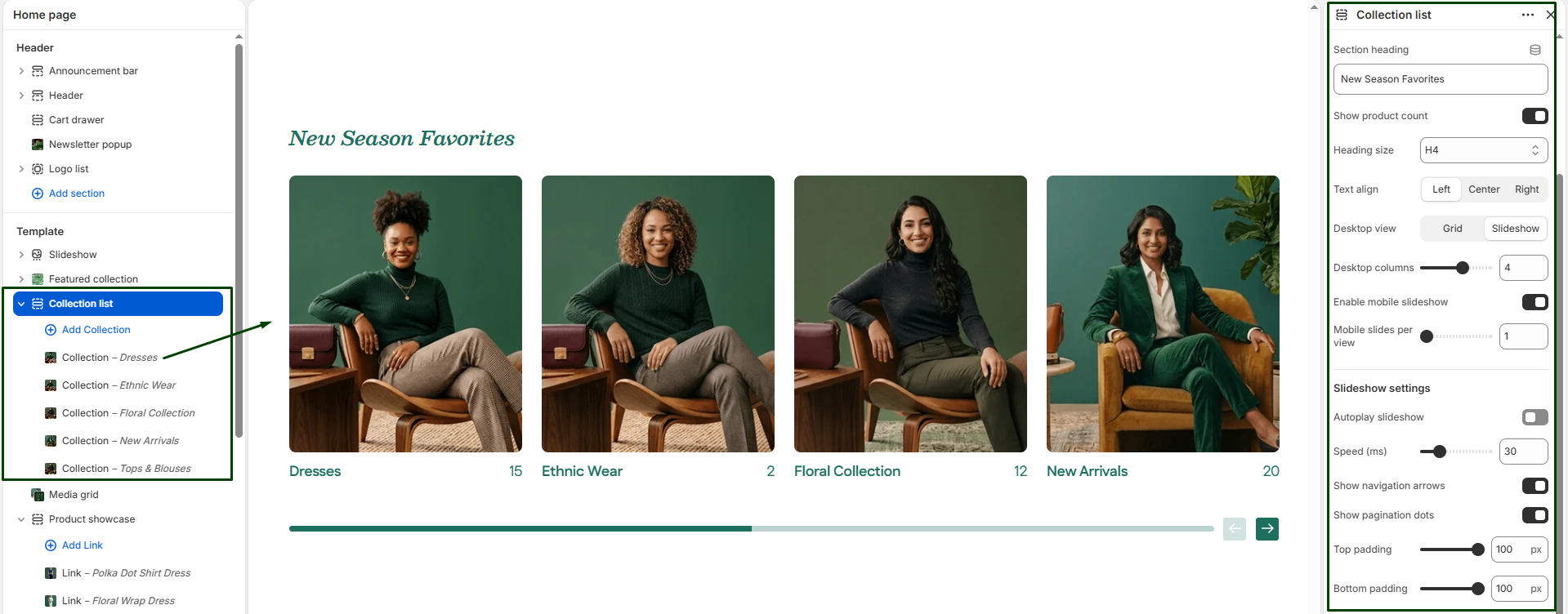
The Collection List section allows you to display multiple collections in a visually engaging slider or grid layout anywhere on your store (typically the homepage). Each collection can feature a custom image, title, and link, making it ideal for highlighting high-level product categories (e.g., “Dresses”, “Shoes”, “Accessories”).
Navigate to Sections > Collection list to customize these settings:
-
- Color scheme: Choose the desired color palette for this section from your theme settings.
- Section width: Choose how wide the section spans on the page:
page-width(aligned with standard content) orfull-width(edge-to-edge). - Section heading, Size, & Alignment: Enter a heading to introduce the section (e.g., “Shop by Category”), select its text size (H1-H6), and choose its alignment (Left, Center, or Right).
- Show product count: Toggle whether to display the total number of items available inside each collection directly on the card.
- Desktop layout: Choose whether to display the collections as a standard
gridor an interactive swipeableslideshow. - Desktop collections per row: Use the slider to specify the number of collections to display per row on desktop screens (1 to 6).
- Enable mobile slider: Turns the grid into a swipeable slider on mobile devices.
- Mobile collections per row: Specify the number of collections to display per row on mobile screens (1 to 3).
- Slider Settings: If using a slideshow layout, you can toggle Autoplay and adjust the Slideshow speed. You can also toggle the visual controls: Show navigation (arrows) and Show pagination (dots).
- Top & Bottom padding: Adjust the vertical spacing (in pixels) above and below the section.
Blocks: Collection
Each block represents one collection card in the slider or grid. You can add as many blocks as needed. Click into a block to configure:
-
- Collection: Select the specific Shopify collection to be displayed.
- Image: Upload a custom image for this collection. (Highly recommended if you want a unique lifestyle visual instead of the default Shopify collection image).
- Collection title: Enter a custom name for the collection display (overrides the default collection name).
- Collection URL: Add a custom URL link (overrides the default collection link).


