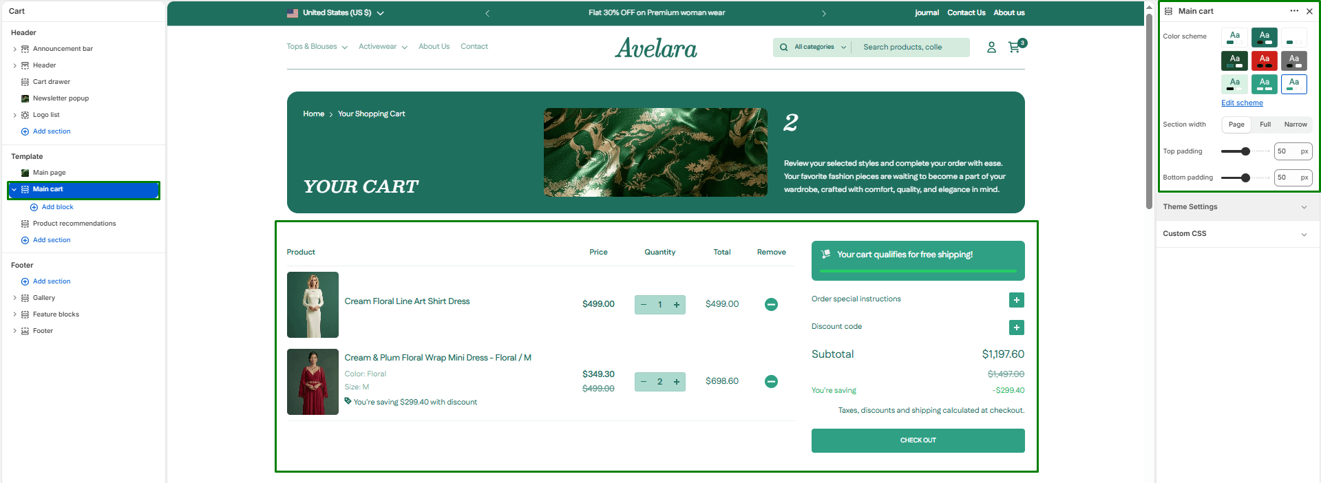
The Main Cart section is the core of the dedicated cart page in your Shopify theme (used if you route users to a page instead of a cart drawer). It displays all selected items and allows customers to update quantities, remove items, add special order instructions, and apply discount codes before proceeding to checkout.
This section is designed to be highly readable, responsive, and minimal—maintaining perfect alignment with the store’s overall design system while reducing checkout friction.
Navigate to Sections > Main cart (you can view this by selecting “Cart” from the template dropdown at the top of your Theme Editor) to customize these settings:
-
- Color scheme: Select a predefined color scheme to control text, background, and border colors for the entire cart layout.
- Section width: Determines how wide the cart content appears on the page. You can choose:
page-width: Standard layout width aligned with other pages.full-width: Stretches across the full browser width.narrow-width: A centered, compact layout (highly recommended for the cart page to improve readability on large desktop screens).
- Top & Bottom padding: Adjust the vertical spacing (in pixels) above and below the cart section.
Blocks
This section supports Shopify’s App Blocks, meaning if you install third-party apps (like “Gift Wrapping” or “Delivery Date Pickers”), you can safely drop their app blocks directly into this cart section.