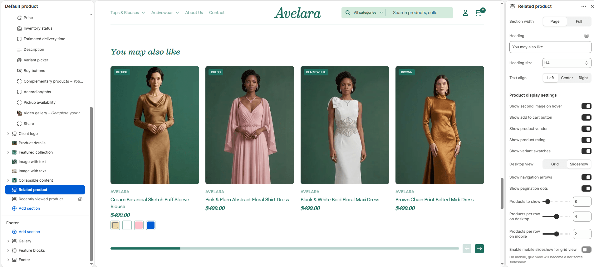
The Related Products section is designed to display a collection of suggested or complementary products at the bottom of the product page. Using Shopify’s built-in recommendation algorithm, it helps increase cross-selling opportunities and improves the customer browsing experience by dynamically showcasing similar items. The layout supports both grid and slider views, allowing full customization for desktop and mobile displays.
Navigate to Sections > Related products (this section is usually found at the bottom of the “Default product” template) to customize these settings:
Layout settings
-
- Color Scheme: Selects the overall visual color theme for the entire section.
- Section Width: Choose how wide the section spans on the page:
page-width(keeps the content aligned with the main page container) orfull-width(stretches the section across the full browser width). - Heading, Size, & Alignment: Set the main title of the section (e.g., “You may also like”), choose the size (H1-H6), and choose the text alignment (Left, Center, or Right).
- Desktop layout: Choose how products appear on desktop:
grid(static layout) orslideshow(scrollable carousel format). - Desktop products per row: Sets the number of products displayed per row in desktop view (2 to 6).
- Enable mobile slider: Turns the static grid into a horizontal slider layout on mobile screens, significantly improving usability and saving vertical space.
- Mobile products per row: Defines how many products are shown side-by-side on mobile devices (1 to 3).
- Slider Settings: If using a slideshow layout, you can toggle Show navigation (arrows) and Show pagination (dots).
- Products to show: Controls how many total products the algorithm should fetch and display in the section (up to 50).
- Top & Bottom Padding: Adds vertical space (in pixels) above and below the section to separate it visually from other content.
Product card settings
-
- Show second image on hover: Displays the product’s secondary image when hovered over (if available).
- Show variant swatches: Shows available variants (like color options) directly on the product card.
- Show Add to Cart Button: Displays an “Add to Cart” button directly under each product card for quick purchasing.
- Show product vendor: Displays the product vendor/brand name below the product title.
- Show product rating: Shows the star rating or review snippet below the product name (if enabled through a compatible reviews app).