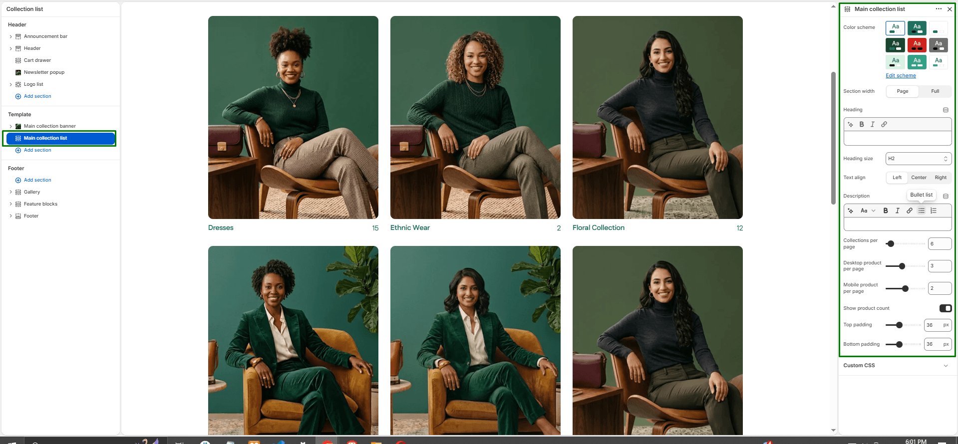
The Main Collection List section powers your store’s “Collection List” template (the default page that displays all your store’s collections, usually found at your /collections URL). It showcases your product groups in an organized grid layout.
Navigate to Sections > Main collection list (you can view this by selecting “Collections list” from the template dropdown at the top of your Theme Editor) to customize these settings:
-
- Color scheme: Selects the background and text color style applied to the section.
- Section width: Controls how wide the section appears on the page:
page-width(aligned with standard content) orfull-width(extends edge-to-edge). - Heading, Size, & Alignment: Add a customizable heading at the top of the section (e.g., “All Collections”), set its size (H1-H6), and choose its text alignment (Left, Center, or Right).
- Description: Optional text area to provide a short introduction or context about your collections.
- Collections per page: Defines how many total collection cards to display on a single page before automatic pagination is applied.
- Desktop collections per row: Use the slider to set the number of collections displayed in a single row on desktop devices (1 to 6).
- Mobile collections per row: Use the slider to control how collection cards appear on mobile screens (1 to 3 columns per row).
- Show product count: Toggles whether to display the total number of products available within each collection directly on the card.
- Top & Bottom padding: Adjust the vertical spacing (in pixels) above and below the section.