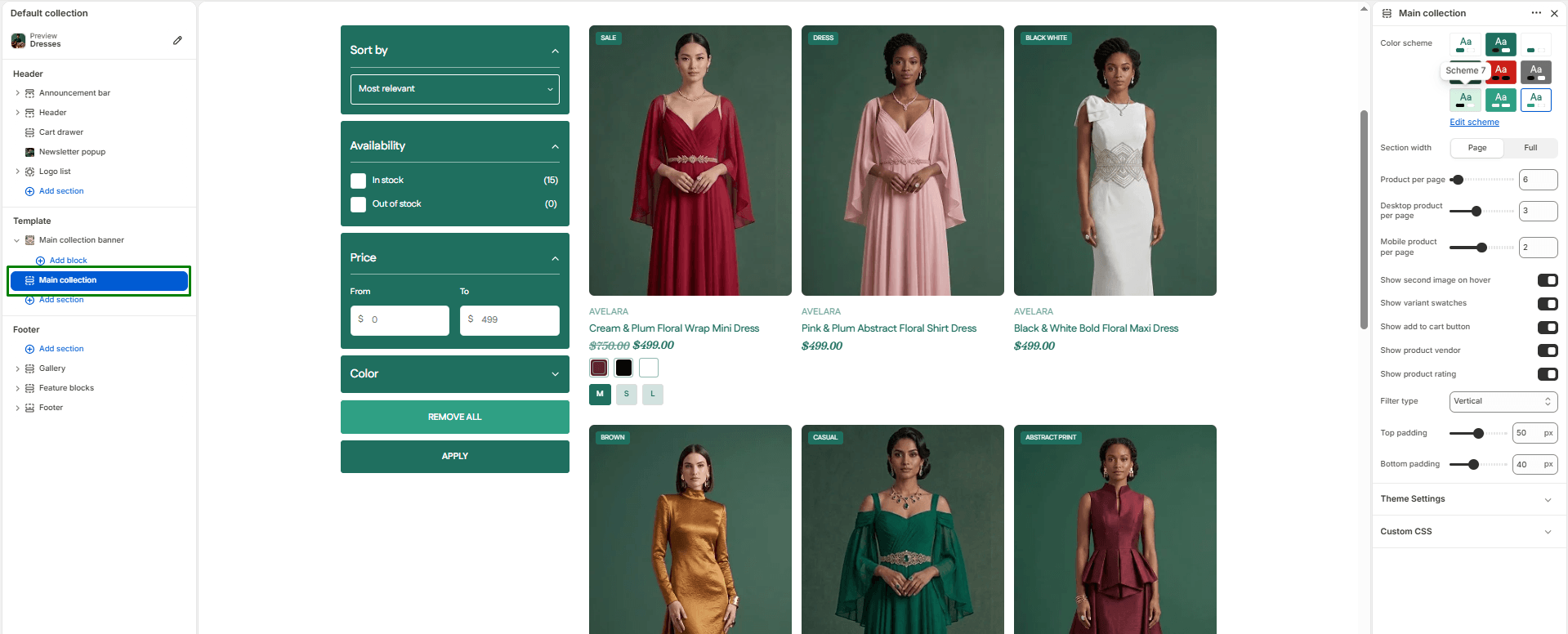
The Main Collection section is the powerhouse of your individual Collection pages (the template used when a customer clicks into a specific category like “Summer Dresses”). It supports advanced product filtering, pagination, grid configuration, and highly adjustable layouts for both desktop and mobile.
Navigate to Sections > Main collection (you can view this by selecting “Default collection” from the template dropdown at the top of your Theme Editor) to customize these settings:
Layout Settings
-
- Color scheme: Selects the color style applied to the section background and text to match your overall theme.
- Section width: Controls how wide the grid appears on the page:
page-width(uses standard content width) orfull-width(extends layout edge-to-edge). - Product per page: Defines how many products to load per page before pagination kicks in (e.g., 9, 12, or 24).
- Desktop products per row: Use the slider to set how many products appear per row on desktop (1 to 6).
- Mobile products per row: Use the slider to set how many products appear per row on mobile screens (1 to 3).
- Filter type: Controls how your product filters (e.g., Size, Color, Price) appear on the page:
- Vertical: Filters are displayed permanently on the left side of the grid.
- Horizontal: Filters are displayed in a horizontal layout above the grid.
- Drawer: Filters slide out from the side of the screen when clicked (a great modern, space-saving layout).
Product Card Settings
Control exactly what information is visible on the individual product cards within the grid:
-
- Show second image on hover: Enable this to reveal a secondary product image when a customer hovers over the card with their mouse.
- Show variant swatches: Displays color/material swatches directly on the product card.
- Show ‘Add to cart’ button: Toggle to display a quick add-to-cart button below each product.
- Show product vendor: Toggle to show the product vendor/brand name under the title.
- Show product rating: Toggle to display the product’s star rating (requires a compatible review app).
- Top & Bottom padding: Adjust vertical spacing (in pixels) above and below the section.