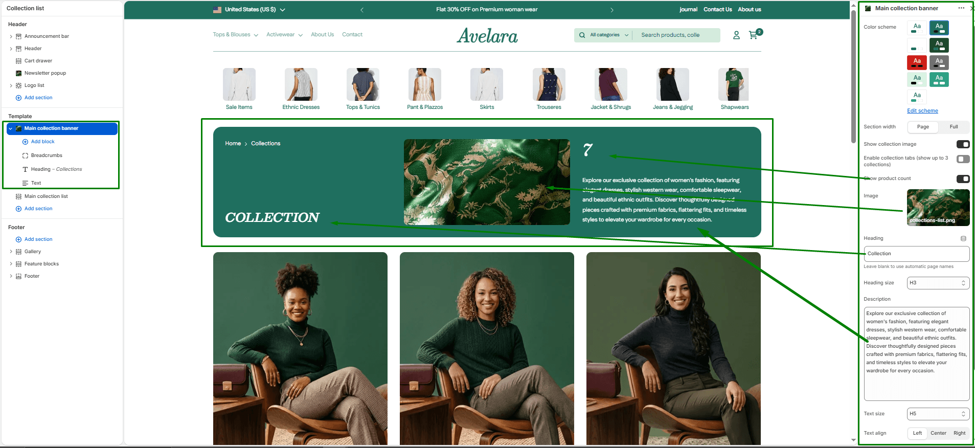
The Main Collection Banner section is displayed at the very top of your collection pages. It sets the scene by highlighting the collection name, a banner image, and a description, giving customers clear context about what collection they are viewing.
Navigate to Sections > Main collection banner (you can view this by selecting “Default collection” from the template dropdown at the top of your Theme Editor) to customize these settings:
-
- Color scheme: Choose a predefined color palette from your theme settings to match the banner background and text colors.
- Section width: Controls how wide the banner section appears on the page:
page-width(matches the site’s default content width) orfull-width(extends the banner to the full browser width for an immersive layout). - Show collection image: Toggle ON/OFF to use the featured image of the current collection (set in your Shopify Admin) as the banner background.
- Enable collection tabs: Toggle to display up to 3 quick-link tabs to other collections directly within the banner, making navigation seamless.
- Show product count: Displays the total number of products inside the collection as a large visual element within the banner.
- Custom Image: Upload or select a custom image to display in the banner. If a custom image is chosen, it will override the default collection image.
- Custom Heading & Size: Enter a custom heading to override the default collection name, and choose the heading tag size (H1-H6).
- Custom Description & Text size: Enter a custom description to override the default collection description, and control the font size (H1-H6) for this text.
- Text align: Aligns all banner text content to the Left, Center, or Right.
- Top & Bottom padding: Adjust the vertical space (in pixels) above and below the banner content.