The Main Product section is the most important section of your store. It displays the core product information (images, title, price, description, variants, and buy buttons) on your individual product pages. This section is highly modular, allowing you to build the perfect layout using customizable content blocks.
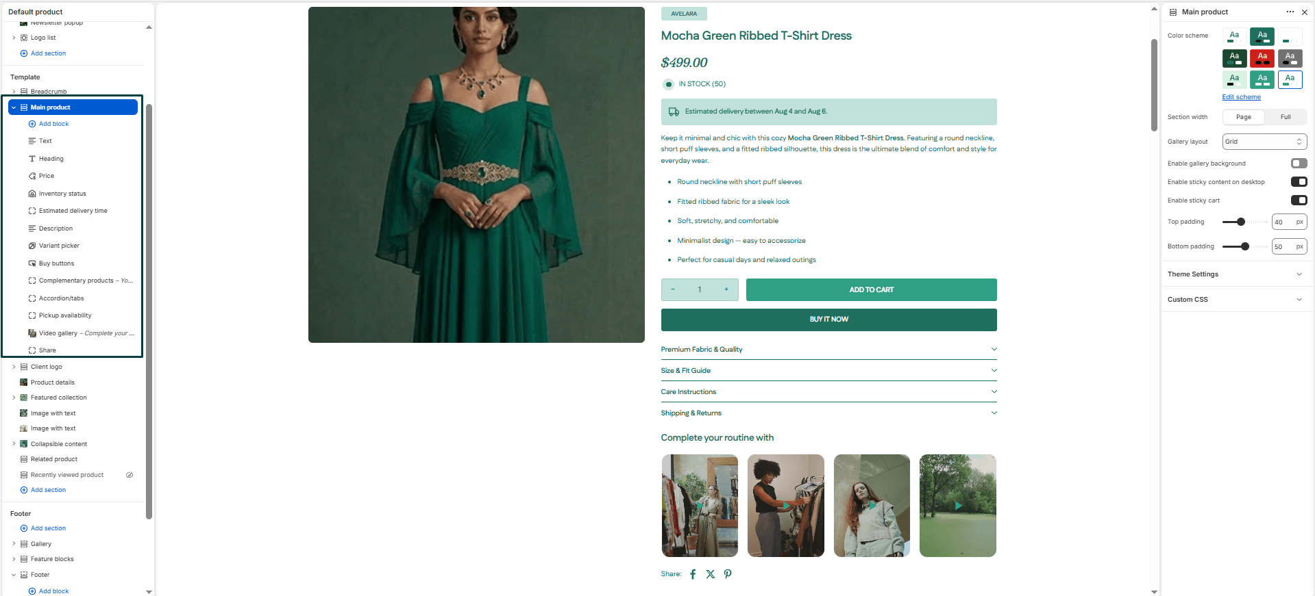
Navigate to Sections > Main product (view this by selecting “Default product” from the template dropdown at the top of your Theme Editor) to customize the master settings:
Section settings
-
- Color Scheme: Selects the visual color theme for the entire section background and text.
- Section Width: Determines whether the section spans
full-widthor fits within the constrainedpage-widthcontainer. - Gallery Layout: Controls how your product images are displayed. Choose between
grid, thumbnailsbottom, thumbnailsleft, or a swipeableslideshow. - Enable Gallery Background: Adds a subtle background behind the product image gallery area to create better contrast for products shot on white backgrounds.
- Enable Sticky Content: Keeps the product information (title, price, buy buttons) fixed on the screen while the user scrolls down through the image gallery on desktop.
- Enable Sticky Cart: Activates a floating “Add to Cart” bar that appears at the top/bottom of the screen when the user scrolls past the main buy buttons, ensuring they can always purchase.
- Top & Bottom Padding: Adds vertical spacing (in pixels) above and below the product section.
Product blocks
The Main Product section is built using movable blocks. You can rearrange them, hide them, or add new ones depending on your needs. Below are the available block types:
-
- Text: Displays a short custom text string (great for a brand name or promotional tagline above the title).
- Title: Shows the product’s title dynamically.
- Price: Shows the product’s price, including sale badges and compare-at prices.
- Description: Displays the product’s full description.
- Variant Picker: Allows customers to choose product variants (e.g., size, color).
- SKU: Displays the stock keeping unit number for the selected variant.
- Size Chart: Adds a clickable “Size chart” link that opens a popup. You can select which Shopify Page contains your size chart content.
- Rating: Displays the product’s star rating and review count (requires a compatible Shopify review app).
- Pickup Availability: Displays local pickup information for customers near your physical store locations.
- Inventory: Displays stock availability (e.g., “Only 2 left!”). You can set a low inventory threshold (e.g.,
10) so the warning only appears when stock is running low, creating urgency. - Buy Buttons: Adds the “Add to Cart” and dynamic checkout buttons (Buy It Now). You can toggle the quantity selector and gift card recipient form here.
- Complementary Products: Suggests matching or related products using Shopify’s “You may also like” algorithm. You can set a custom heading and limit the number of products shown.
- Liquid Code: Add custom Liquid, HTML, or app snippets directly into the product layout.
- Share: Adds social sharing links so customers can share the product page.
- Icon with Text: Build trust by displaying up to 4 icons (e.g., shipping, returns, eco-friendly) with text labels. You can choose to stack them vertically or align them horizontally.
- Product Tabs: Organize long-form information into a collapsible
accordionor horizontaltabs. You can define up to 4 headings and map the content to your product description or custom text. - Video Block: Add up to 4 videos (with custom thumbnails) to showcase tutorials, lookbooks, or product features.
- Estimated Delivery: Displays an expected delivery range directly on the page to build confidence. You can configure processing days, minimum/maximum shipping times, and whether to skip weekends in the calculation.


