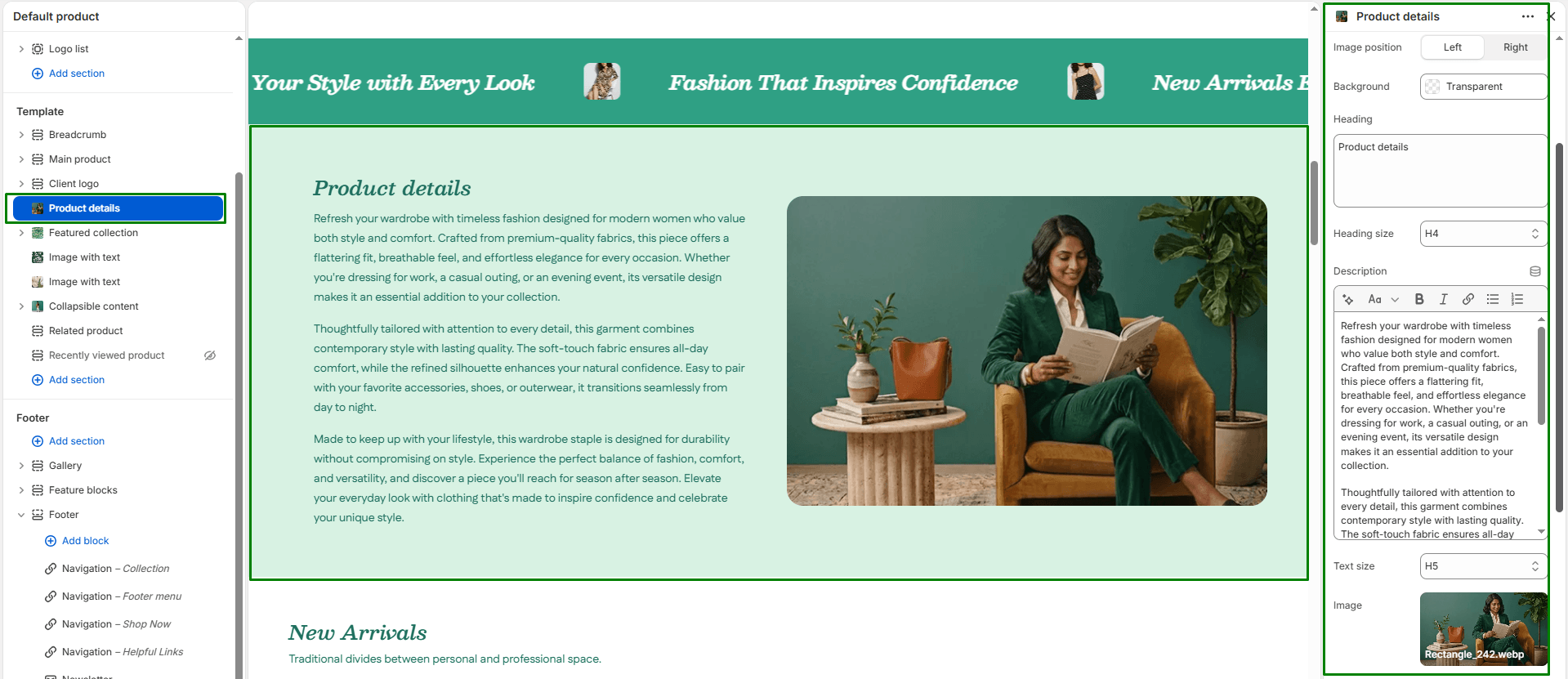
The Product details section uses a dual-column “zigzag” layout to highlight specific features, materials, or the story behind your product. While it functions identically to the Image with text section, it is explicitly designed to be stacked on your Product pages to create an immersive, long-form product description.
Section settings
-
- Color scheme: Choose the theme color palette for the overall section background.
- Section width: Choose whether the section is constrained to
Pagewidth or stretches acrossFullbrowser width. - Layout:
- Image position: Choose whether the image appears on the
LeftorRightside of the text on desktop screens. Tip: Stack multiple “Product details” sections on your product page and alternate this setting to create a beautiful zigzag flow! - Background color: Select a background color just for the text box area to create contrast against the main page.
- Image position: Choose whether the image appears on the
- Image: Upload an image showcasing a specific product detail, lifestyle shot, or feature.
- Text content:
- Heading & size: Add a title highlighting the feature (e.g., “Premium Materials”) and select its size (H1-H6).
- Description & Text size: Add supporting body text to explain the detail in depth.
- Button:
- Button label: Enter optional call-to-action text (e.g., “Learn More”).
- Button link: Choose where the button should link to.
- Button style: Select the visual style of the button (
PrimaryorSecondary).
- Top padding / Bottom padding: Adjust the vertical spacing (in pixels) above and below the section.