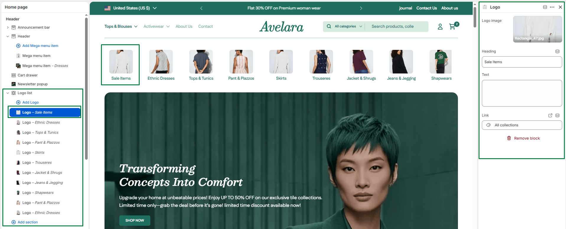
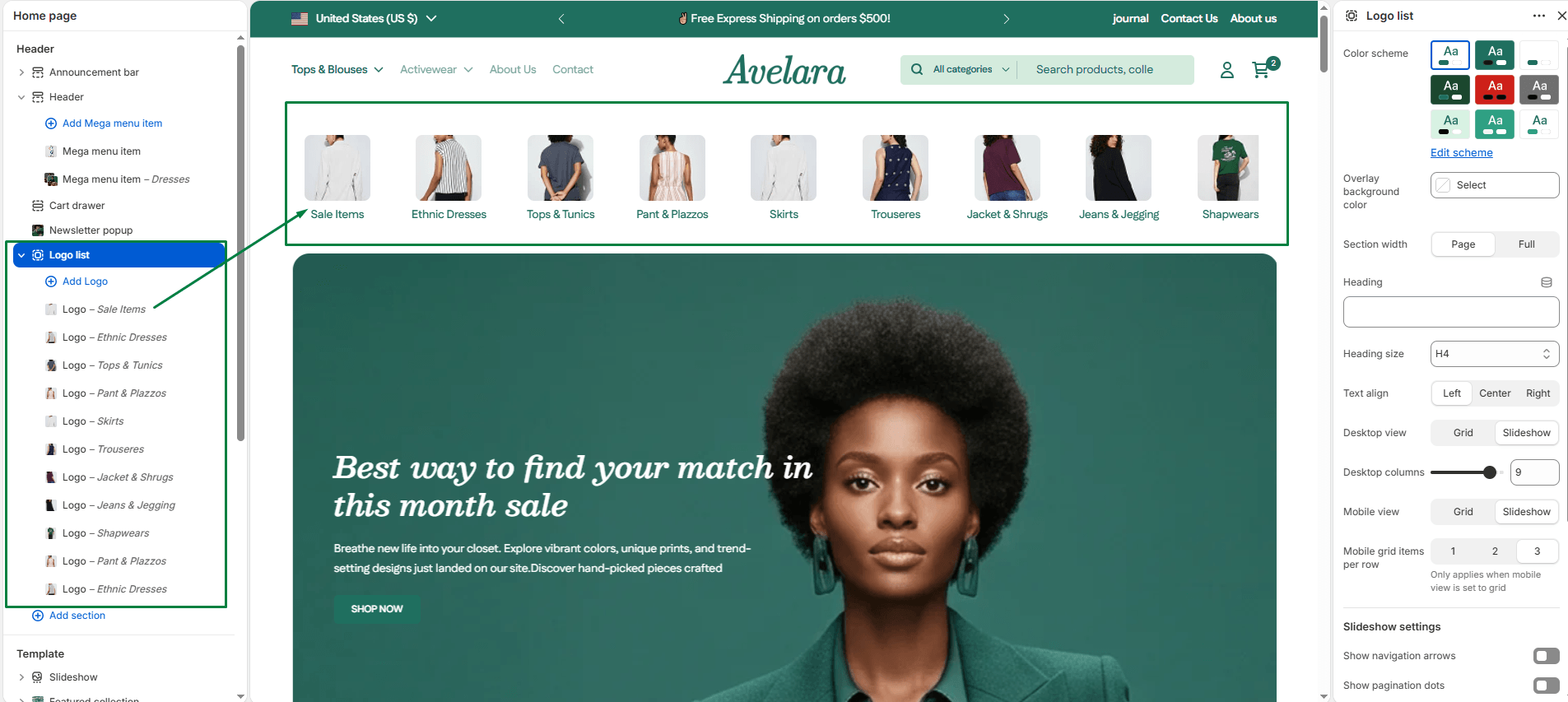
The Logo List section allows you to showcase brand features, partner logos, or press mentions in a sleek grid or slider layout. It is highly effective for building instant trust on your homepage or product pages.
Section settings
-
- Color scheme: Select your preferred color palette for the general section background and text.
- Container background color: Choose a specific background color just for the logo list container box (useful if you need your logos to sit on a specific solid color for contrast).
- Section width: Choose how wide the section appears:
Page(constrained) orFull(edge-to-edge). - Heading & size: Add a main title for the section (e.g., “As Featured In”, “Our Partners”) and choose the heading tag (H1-H6).
- Text align: Align the heading text to the
Left,Center, orRight. - Desktop layout:
- Desktop view: Choose how the logos appear on desktop (
GridorSlideshow). - Desktop columns: Select the number of logos displayed per row on desktop (from 2 up to 10 items).
- Desktop view: Choose how the logos appear on desktop (
- Mobile layout:
- Mobile view: Choose how the section appears on mobile devices (
GridorSlideshow). - Mobile grid items: Set how many logos appear per row on mobile when using the Grid view (1, 2, or 3).
- Mobile view: Choose how the section appears on mobile devices (
- Slideshow settings: If you selected ‘Slideshow’ for either desktop or mobile, you can customize:
- Show navigation: Display arrow controls for manual navigation.
- Show pagination: Display small dots below the slider.
- Autoplay & Slide speed: Automatically rotate through the logos and define the transition speed.
- Top padding / Bottom padding: Adjust vertical spacing (in pixels) above and below the section.
Blocks: Logo item
Each Logo block represents one item—a brand logo, product badge, or feature icon.
-
- Image: Upload the logo graphic. (Tip: Use transparent PNGs with consistent dimensions for the cleanest look).
- Heading: Add an optional short title below the logo.
- Text: Add optional supporting text beneath the heading (e.g., “Secure Checkout”).
- Link: Make the entire logo block clickable by adding a destination URL.