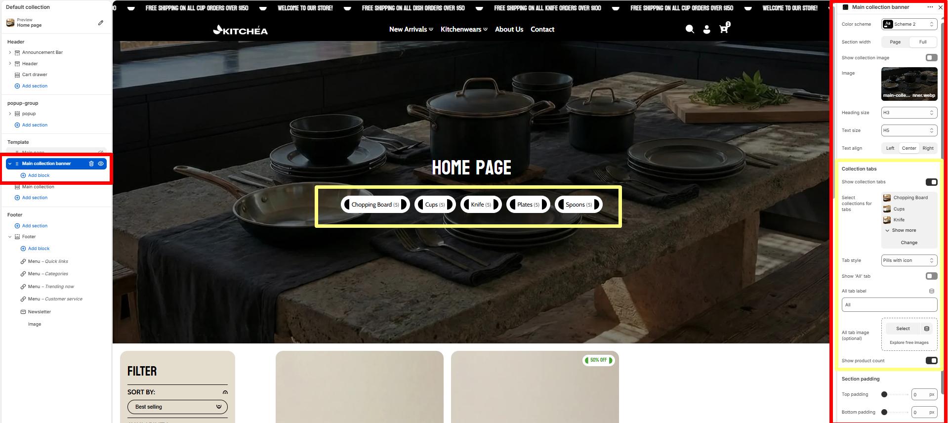
Main Collection Banner
The Main Collection Banner section appears at the top of the collection listing page (/collections). It is used to introduce all collections with a prominent heading and supporting text.
Color scheme
Allows you to select from available theme color schemes to apply background/text styling.
Show collection image
Toggle ON/OFF to display the featured image of the current collection as the banner background.
Image
Upload or select a custom image to display in the banner. If no image is chosen, the collection’s featured image (if available) will be used by default.
Heading size
Choose the heading tag (H1–H6) for the collection title. Typically set to H2 for consistency across pages.
Text size
Sets the size of the subheading or breadcrumb text. Commonly H5 for secondary text.
Text align
Aligns banner text content (Left, Center, or Right).
Show Collection Tabs
Toggle ON to display category tabs above the product grid, allowing customers to quickly switch between different kitchen product collections.
Collection tabs settings
Select collections for tabs
Choose which collections to show as tabs. You can select up to 20 collections. like (“bike”, “accessories”)
Tab style
Select the visual style for collection tabs. Options include pills with images or other available styles.
-
- Simple pills – only pills type tab show .
- Pills with image – tab show pills type with image.
- Minimal underline – only tag show with underline.
Show ‘All’ tab
When enabled, displays an “All” tab that shows products from all selected collections.
All tab label
Customize the text label for the “All” tab.
All tab image (optional)
Upload an optional image to display with the “All” tab.
Show product count
When enabled, displays the number of products in each collection tab next to the collection name.
Top Padding / Bottom Padding
Adjusts the spacing above and below the section.
Blocks Settings
You can enrich your banner with multiple content blocks to create a compelling visual + textual combo.
Supported Content Blocks:
-
- Text
- Heading
- Button


