Featured Collection
The Featured Collection section allows you to highlight products from one or more collections directly on your homepage. It supports toggling between collections, customizing the display layout, and configuring product card options.
Color scheme
Selects the color scheme for the entire section (e.g., Scheme 1, Scheme 2).
Section width
-
- Page – aligns with the site’s content width.
- Full – stretches across the full viewport width.
Heading
Add a heading text for the section.
Subheading – Highlight Word
This word will be visually highlighted using the Subheading font style, adding a decorative touch to your blog section title.
Heading size
Choose heading size (H1–H6) for the section heading.
Subheading/Text
In the Text box, enter the description.
Text Size
Allows choosing Text hierarchy (e.g., H1 To H6).
Product card
Show second image on hover
Enable to show the product’s second image when hovered.
Product card background
Option to choose between Transparent or Solid background for product cards.
Enable Quick View
Toggle ON to allow customers to quickly view product details without leaving the current page.
Flip Effect Image
Toggle ON to enable a 3D flip animation on the product card image when hovered.
Desktop layout
Choose layout style: Grid or Slider.
Products to show(slideshow)
Define the total number of products to display from the collection.
Products per row on desktop
Set how many products to display per row.
Products per row on mobile
Set how many products to display per row on smaller screens.
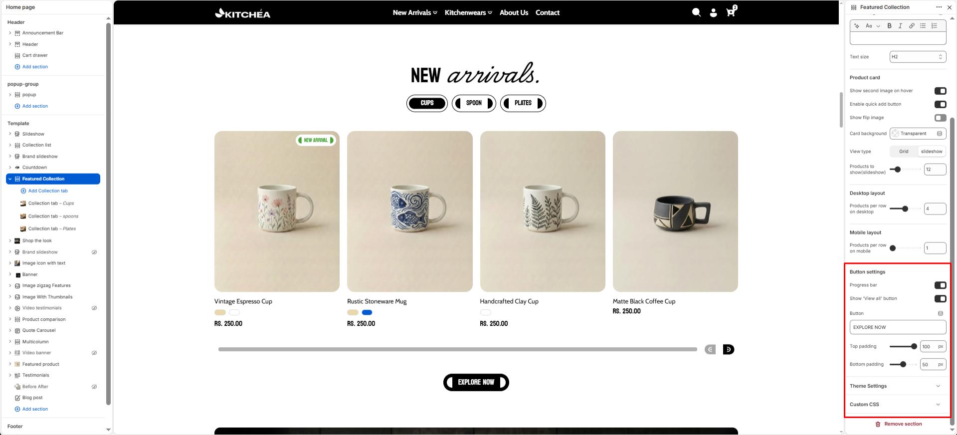
Show “View all” button
Toggle to show or hide a button linking to the full collection page.
Show Progress Bar
Toggle ON to display navigation arrows and a progress bar below the slideshow.
Top padding
Adjust spacing above the section (in pixels).
Bottom padding
Adjust spacing below the section (in pixels). 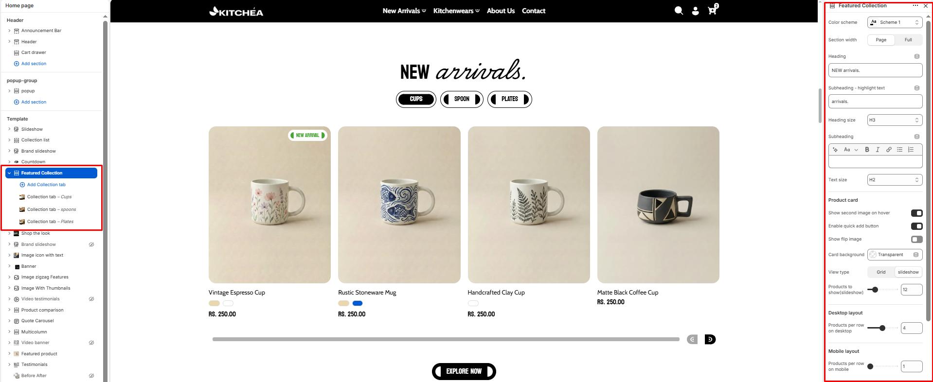
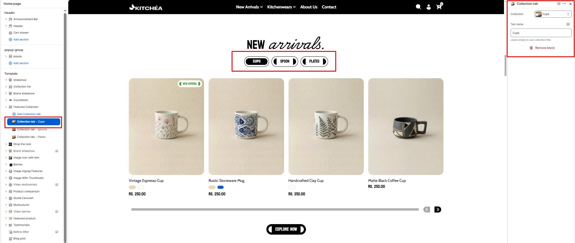
Blocks – Collection tab
Collection
Choose which collection’s products to display in this block.
Label/Tab name
Text displayed as the tab button for the collection.