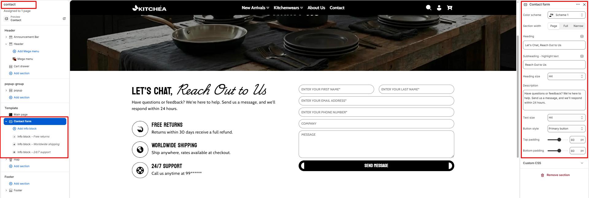
Contact form
A contact form is helpful in generating leads and boosting sales and conversions by understanding your customers’ needs.
Color scheme
Select a color system for background, text, and button color.
Section width
-
- Page – aligns with the site’s content width.
- Full – stretches across the full viewport width.
- Narrow: Centered, compact layout (recommended for better readability).
Heading
Add a heading text for the section.
Subheading – Highlight Word
This word will be visually highlighted using the Subheading font style, adding a decorative touch to your blog section title.
Heading size
Choose heading size (H1–H6) for the section heading.
Description/Text
Add a text for the section.
Text size
Choose text size (H1–H6) for the section .
Button Style
-
- Primary: The button will have a filled background.
- Solid: The button will have a transparent background with a border and text.
Top padding
Adjust spacing above the section (in pixels).
Bottom padding
Adjust spacing below the section (in pixels).
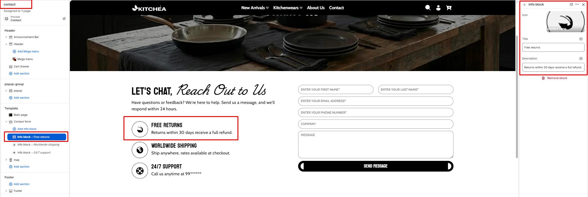
Blocks – Info block
Each block adds a contact information item displayed alongside the form. You can add multiple info blocks to highlight your store’s support details.
Icon
Upload a small icon image to visually represent the contact info block such as a phone icon, email icon, or location pin.
Title
Enter the title for this info block. Example: Free Returns, Worldwide Shipping, 24/7 Support.
Description
Enter the supporting text for this info block. Example: Returns within 30 days receive a full refund, Ship anywhere with rates available at checkout.