Main collection list
A collection list is a type of page that displays all active collections or specifically chosen collections. It serves as a central hub where customers can browse through various collections of products offered by the store.
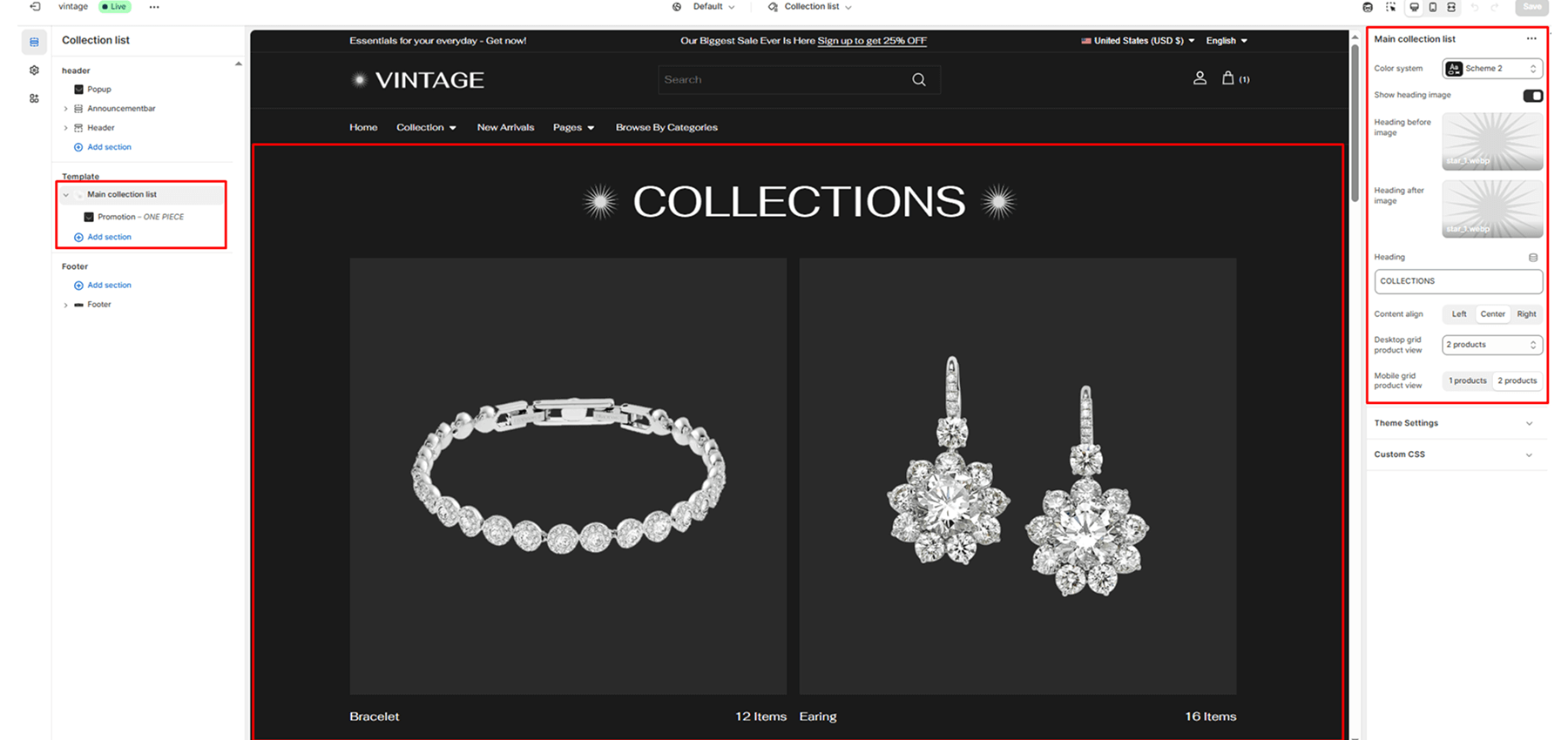
Color scheme
Sets the color scheme (background, text, etc.) for the section.
Show heading image
Enables or disables a decorative heading image.
Heading before image
An optional image is displayed before the main collection heading.
Heading after image
An optional image is displayed after the main collection heading.
Heading
Enter text to display as a heading.
Content position
This setting determines the horizontal alignment of text within the section. It gives the merchant control over how content such as headings, descriptions, or buttons are positioned, enabling better alignment with their store’s design and layout preferences.
Left: Aligns all text to the left.
Center: Centers the text horizontally.
Right: Aligns all text to the right.
Desktop grid product view
Sets the number of columns on desktop (options: 2, 3, 4).
Mobile grid product view
Sets the number of columns on mobile (options: 1, 2).
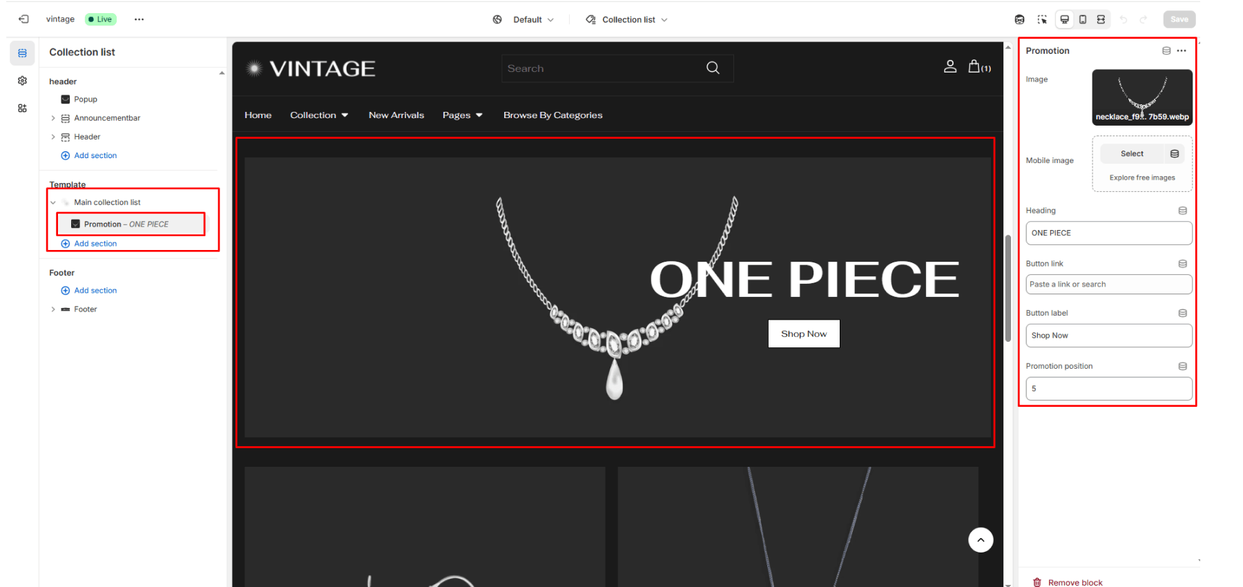
Block: Promotion (collection)
Image: Image to represent the promotion.
Heading: Main heading for the promotion. Example: “Summer Sale”.
Text: Description or message below the heading.
Button label: Button text, e.g., “Shop Now”.
Link: URL to which the promotion button should link.
Promotion position: Insert this block after how many products (e.g., 1 = after the first product). Min: 1, Max: 50.