Featured collection
The Featured Collections section serves as a spotlight for the most notable collections on the site. It provides visitors with curated selections or complete collections, enabling easy exploration of products aligned with their interests.
Color system
Select a color system for the background, text, and button color.
Title
Enter text to display as a title on the featured collection.
Content alignment
Change text position to left, center, and right.
Layout
Choose the layout that best suits your page’s design. There are two different modes to choose from for your store: grid/carousel.
Product View
The maximum number of products per tab.
Desktop Grid Product View
Adjust the Products per Row slider/grid to specify the number of products to display within each row inside the section. The minimum number is 2 products and the maximum is 5. This setting applies to desktop display devices.
Mobile Grid Product View
Use the Products per row on mobile radio buttons to specify the number of products to display in each row inside the section. The options are 1 and 2. This setting applies to mobile display devices.
Enable Swipe on Mobile
Select/deselect to enable the Swipe on Mobile.
Add to Cart Button
Select/deselect to show the Add to Cart button on the product card.
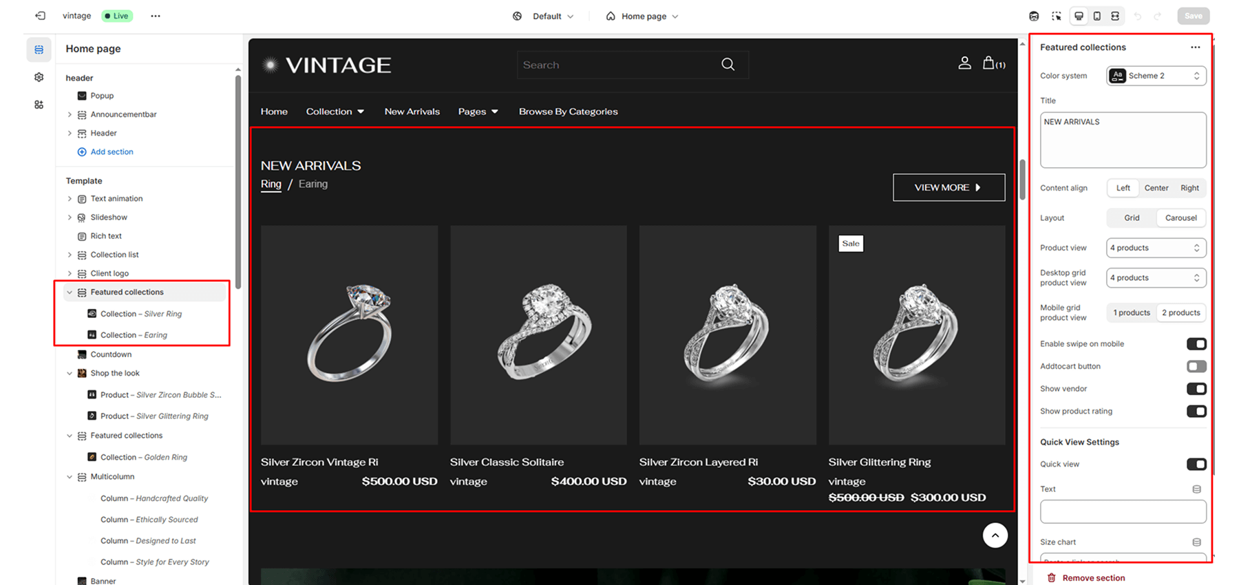
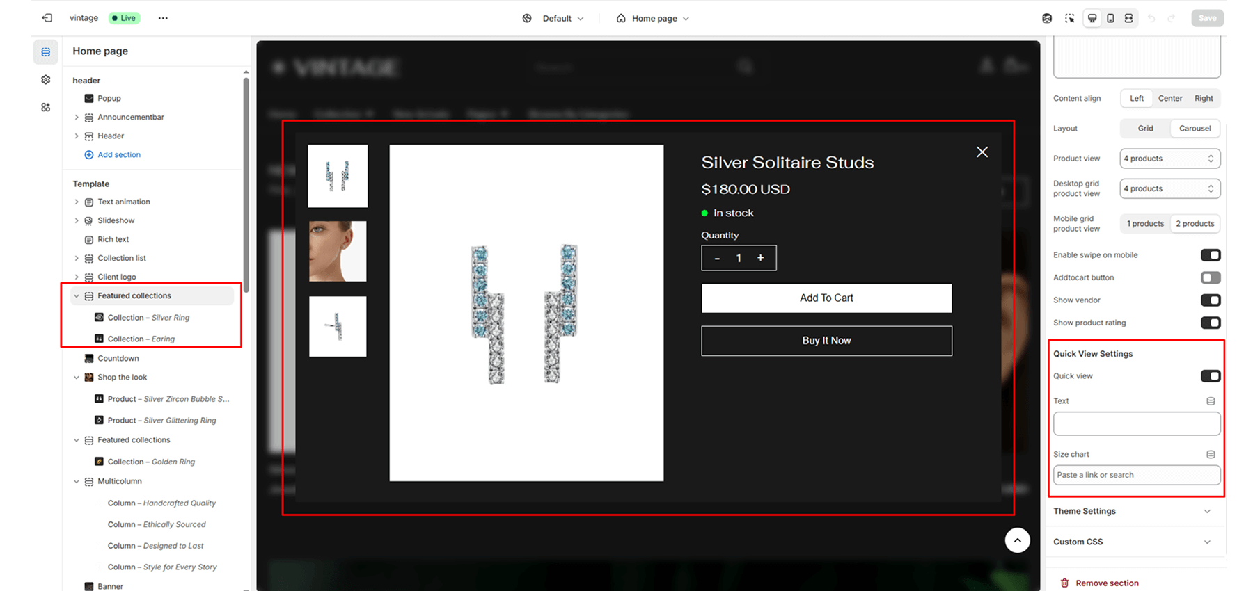
Quick View Settings
Quick View
Select the Enable quick view checkbox to show/hide a “Choose options” button on product tiles inside the section. A store visitor uses the button to choose product options, like variants, to add to their cart. To use this option with the pop-up.
Text
Show custom text on the quick view popup.
Size Chart
Select the page for the size chart.
Blocks
Tab title
Select multiple blocks to show tabs and write the tab titles; otherwise, show the collection name.
Collection
Select the collection to show the selected collection’s products.
Button Label
Add button label to redirect to the collection page.


