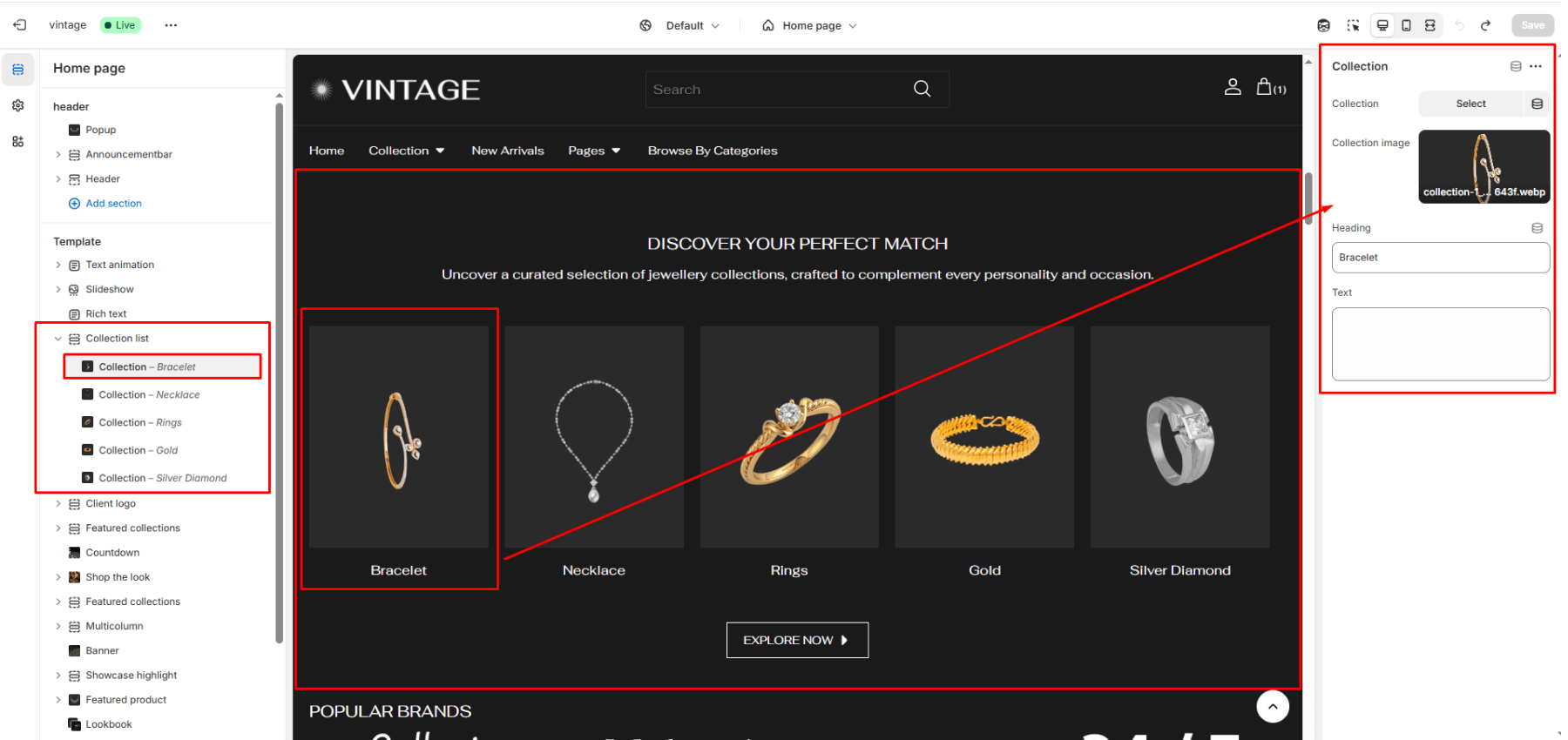
Collection list
This section displays collections in a customizable grid or slider layout, allowing you to showcase multiple collections with images and descriptions.
Color system
Select a color scheme defined in your theme. This controls the background and text color of the entire section.
Title
Field allows you to set a main title for the section.
Description
Field allows you to add descriptive text below the title.
Button label
Add button label for button.
Link
Add button link to redirect to collection page.
Content align
You can set text align left, center and right.
Product View
The maximum number of collection limit.
Layout
Choose the layout that best suits your page’s design. There are two different modes to choose from for your store Grid/ Carousel.
Desktop Grid Product View
Adjust the Collection per row slider/grid to specify the number of collections to display within each row inside the section. The minimum number is 2 products and the maximum is 5. This setting applies to desktop display devices.
Mobile Grid Product View
Use the Collection per row on mobile radio buttons to specify the number of collections to display in each row inside the section. The options are 1 and 2. This setting applies to mobile display devices.
Enable Swipe on Mobile
Select/deselect to enable the Swipe on Mobile.