Collection
This section renders the main collection display on a collection template. It allows extensive control over layout, image presentation, filtering, pagination, and promotional content between products.
Color scheme
Sets the color scheme (background, text, etc.) for the section.
Show heading image
Enables or disables a decorative heading image.
Heading before image
An optional image is displayed before the main collection heading.
Heading after image
An optional image is displayed after the main collection heading.
Show collection image
Toggles visibility of the default collection image from the collection object.
Image
An optional custom image to override the default collection image.
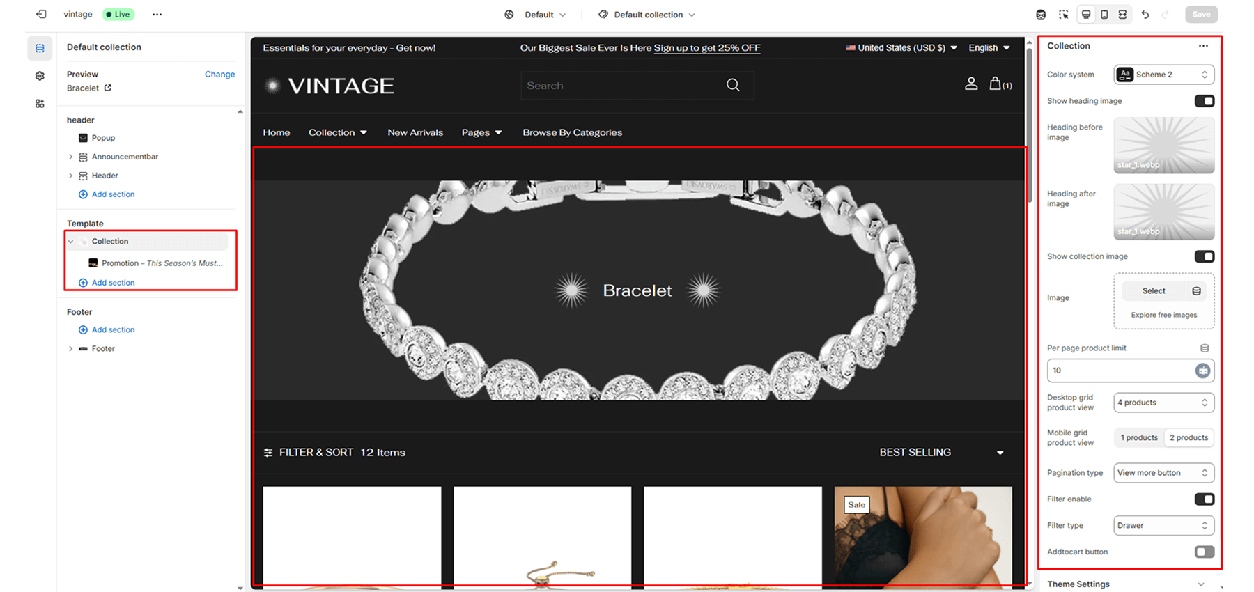
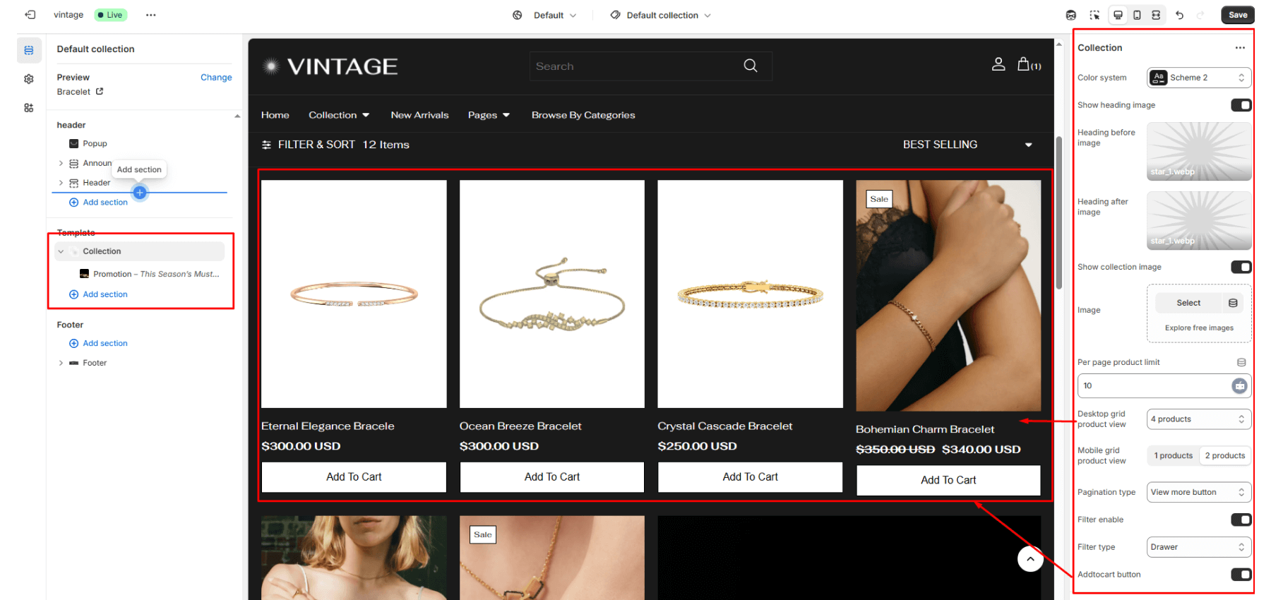
Per-page product limit
Controls how many products to display (e.g., “10”, “20”).
Desktop grid product view
Sets the number of columns on desktop (options: 2, 3, 4).
Mobile grid product view
Sets the number of columns on mobile (options: 1, 2).
Add to cart button
Toggles the display of an “Add to Cart” button below each product.
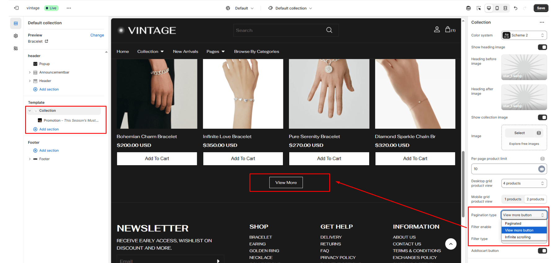
Pagination type
Determines product loading method:
- Paginated: Classic pagination
- Load more: Button to load more
- Scrolling: Infinite scroll
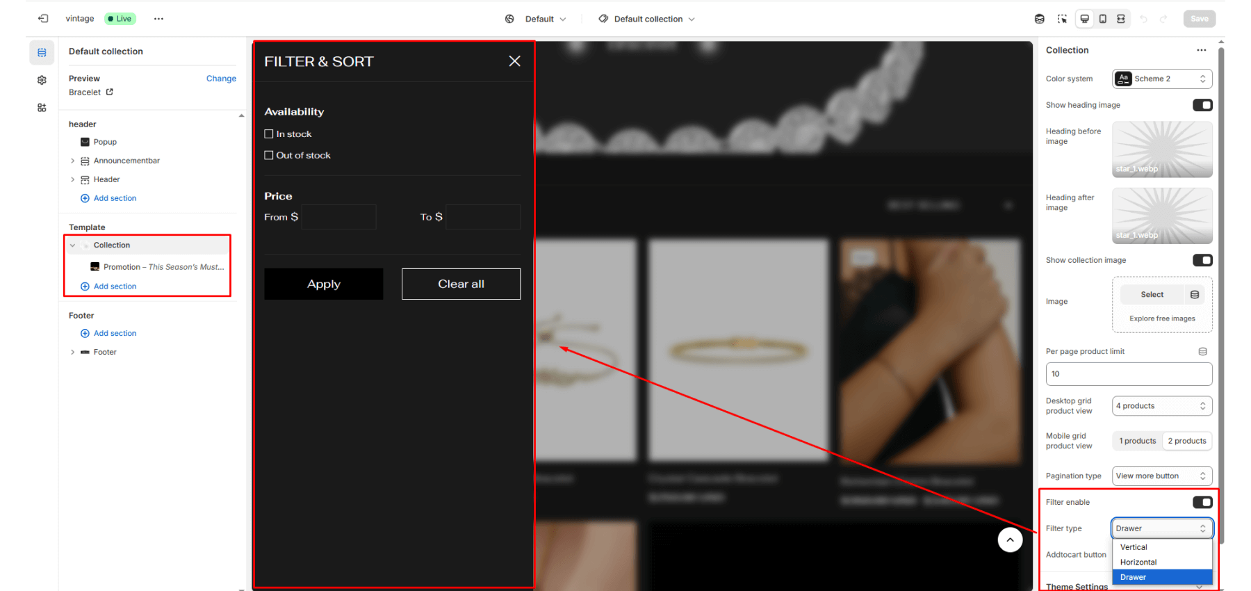
Filter enable
Enables Shopify’s product filtering.
Filter type
Controls filter layout:
- Vertical: Sidebar
- Horizontal: Top bar
- Drawer: Mobile-style drawer
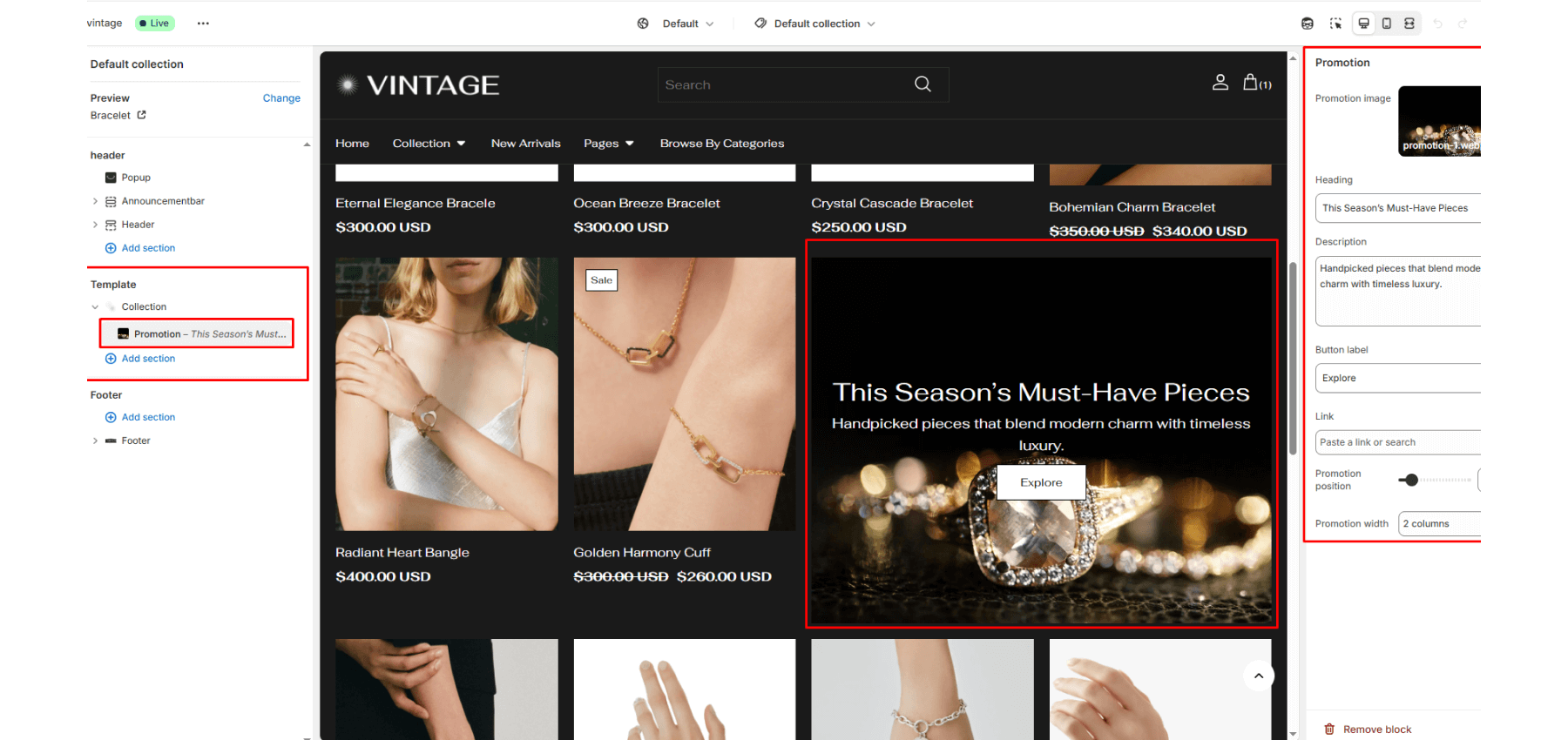
Block: Promotion (collection)
Image: Image to represent the promotion.
Heading: Main heading for the promotion. Example: “Summer Sale”.
Text: Description or message below the heading.
Button label: Button text, e.g., “Shop Now”.
Link: URL to which the promotion button should link.
Promotion position: Insert this block after how many products (e.g., 1 = after first product). Min: 1, Max: 50.
Promotion width: Determines how wide the promotion block spans (1–4 columns). Affects grid layout responsiveness.