Popup
The Newsletter Popup is a promotional modal that appears after a user lands on the store, encouraging them to subscribe to your newsletter. It helps grow your email list and keeps customers informed about updates and offers.
Color scheme
Controls the background and text color of the popup.
Section width
-
- Page – aligns with the site’s content width.
- Full – stretches across the full viewport width.
Top padding
Adds vertical spacing above the announcement content for layout customization.
Bottom padding
Adds vertical spacing below the announcement content.
Newsletter Popup Block
The Newsletter Popup is a promotional modal that appears after a user lands on the store, encouraging them to subscribe to your newsletter. It helps grow your email list and keeps customers informed about updates and offers.
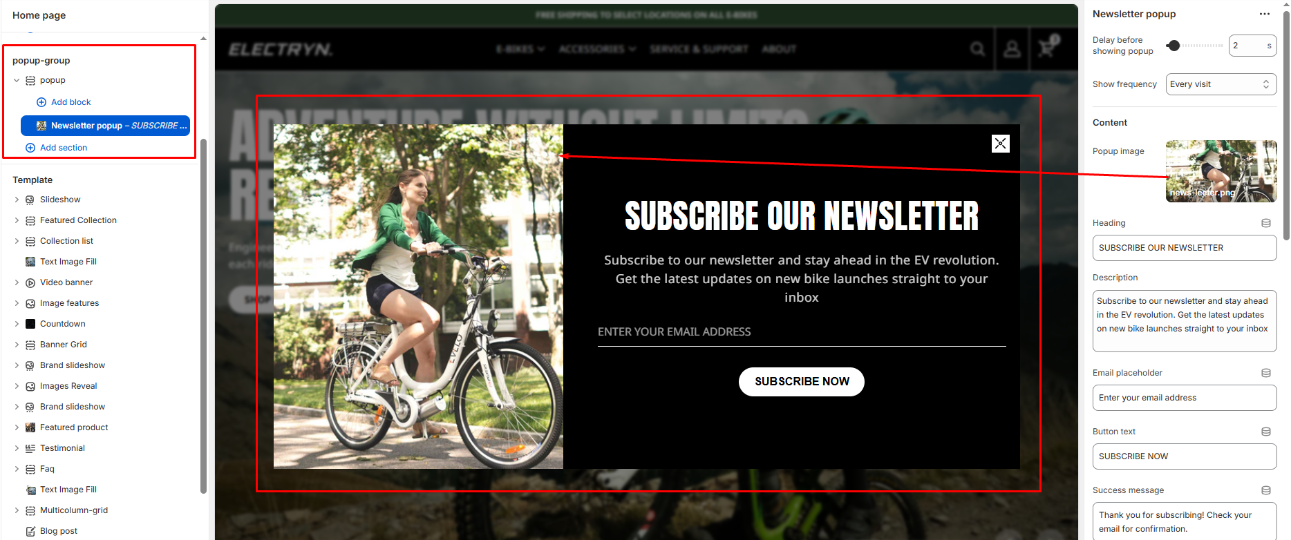
Delay before showing popup
Controls how long to wait before the popup is shown after the page loads.
Show frequency
Prevents the popup from appearing for the same visitor by saving their preference in the browser.
-
- Once per visitor
- Once per day
- Once per week
- Every visit
Popup image
Upload an image to display on one side of the popup. This can be used for product photography, lifestyle images, or brand visuals.
Heading
Add a main heading for your popup (e.g., “Get 10% Off”). This is displayed prominently to attract attention.
Description
Add supporting text below the heading (e.g., “Promotions, new products and sales. Directly to your inbox.”). Basic formatting like bold, italic, and links are supported.
Email placeholder
Set the placeholder text that appears in the email input field.
Button text
Customize the text that appears on the subscription button.
Success message
Enter the message that will be displayed to users after they successfully subscribe.
Show no thanks
When enabled, displays a “No thanks” option allowing visitors to dismiss the popup.
Disclaimer text
Add any legal disclaimers or privacy policy information related to newsletter subscriptions.
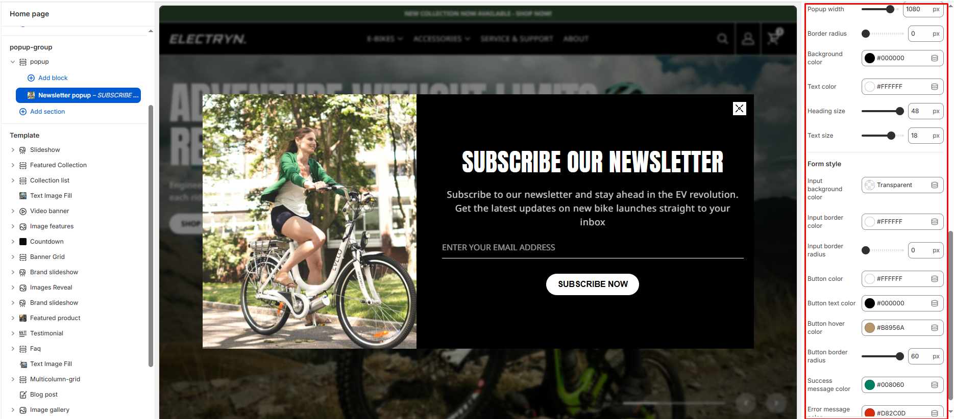
Popup width
Set the width of the popup window (in pixels).
Border radius
Adjust the corner radius of the entire popup (in pixels).
Background color
Set the background color for the popup.
Text color
Choose the default text color for popup content.
Heading size
Adjust the font size for the heading text (in pixels).
Text size
Set the font size for description and other text (in pixels).
Form style
Input background color
Set the background color for input fields in the popup form.
Input border color
Choose the border color for input fields.
Input border radius
Adjust the corner radius of input field borders (in pixels).
Button color
Set the background color for the subscription button.
Button text color
Choose the text color for the subscription button.
Button hover color
Set the button color when users hover over it.
Button border radius
Adjust the corner radius of the button (in pixels).
Success message color
Choose the color for the success message text.
Error message color
Choose the color for the error message text.