Banner grid
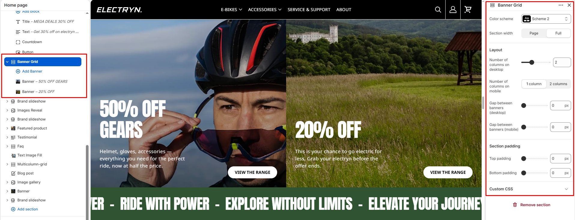
The Banner grid section displays multiple banner blocks in a responsive grid layout, perfect for promotional content or featured categories.
Color scheme
Select a color system for background, text, and button color.
Section width
Choose how wide the section spans on the page:
-
- Page – aligns with the site’s content width.
- Full – stretches across the full viewport width.
Number of columns on desktop
Set how many banner columns to display on desktop screens (1-6).
Number of columns on mobile
Choose between 1 column or 2 columns layout for mobile devices.
Gap between banners (desktop)
Adjust the spacing between banners on desktop (0-100px).
Gap between banners (mobile)
Adjust the spacing between banners on mobile devices (0-100px).
Top Padding
Set top spacing in pixels.
Bottom Padding
Set bottom spacing in pixels.
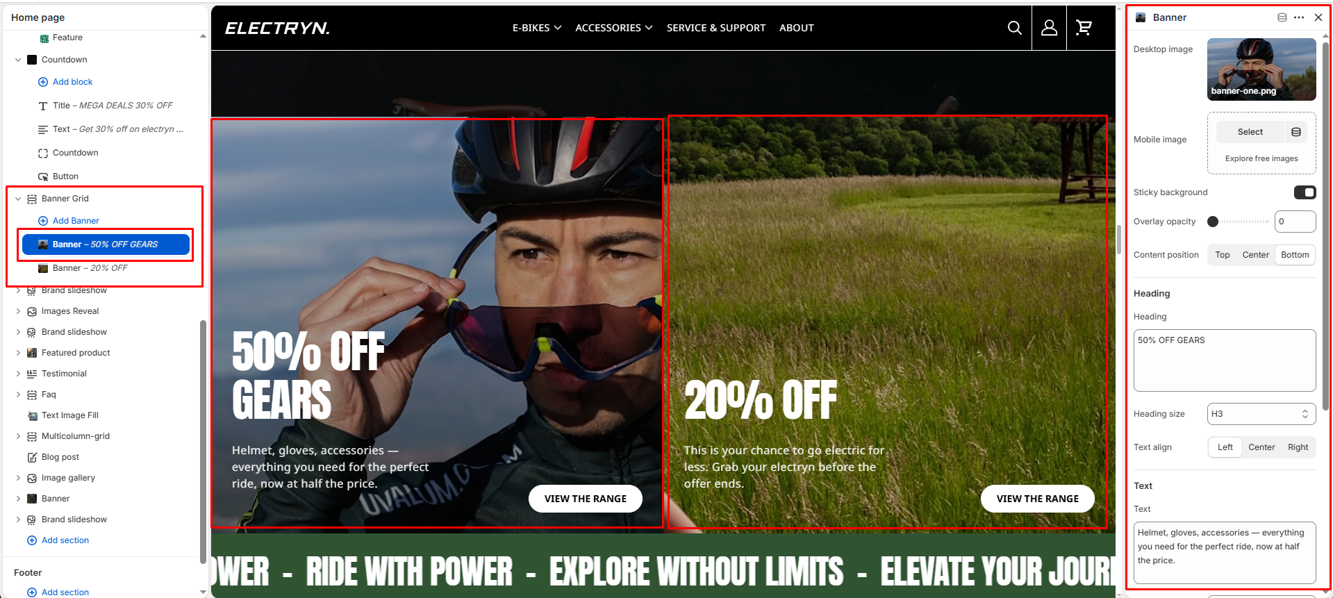
Banner block
Desktop image
Upload the image to display on desktop screens.
Mobile image
Upload an optional image for mobile devices. If left blank, the desktop image will be used.
Content position
Choose where to align the content within the banner: Top, Center, or Bottom.
-
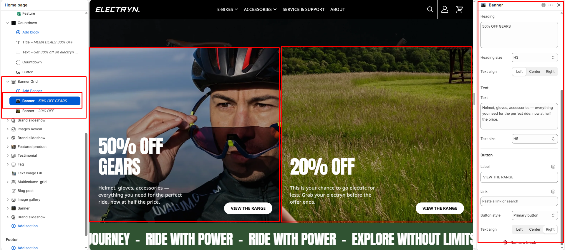
- Heading – Add a heading to your banner grid.
- Text – Include descriptive text or promotional messages.
- Button – Add call-to-action buttons to drive user engagement.