Multicolumn
The Multicolumn section allows you to display multiple columns of content (such as features, stats, or highlights) in a grid layout. Each column is added and managed as a Theme block within the section.
Color scheme
Choose a color scheme (e.g., Scheme 1, Scheme 2) to control background and text colors.
Section width
-
- Page – aligns with the site’s content width.
- Full – stretches across the full viewport width.
Subheading
Optional smaller text displayed above the heading.
Heading
Main heading/title of the section.
Heading size
Choose the size for the heading.
Text
Optional description or intro text under the heading.
Text size
Choose the size for the body text.
Text align
Align all text in the section: Left, Center, or Right.
Columns per row (desktop)
Select how many columns to display per row on larger screens (e.g., 2, 3, 4).
Stack columns on mobile
Enable to stack columns vertically on smaller screens for better mobile readability.
Top padding
Adjust the spacing above the section (in pixels).
Bottom padding
Adjust the spacing below the section (in pixels).
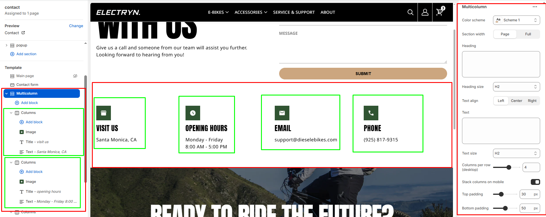
Theme blocks
You can add the following theme blocks inside each column:
- Image block – Add images to your columns
- Title block – Add headings within columns
- Text block – Include descriptive text or content
- Button block – Add call-to-action buttons
- And other available blocks


