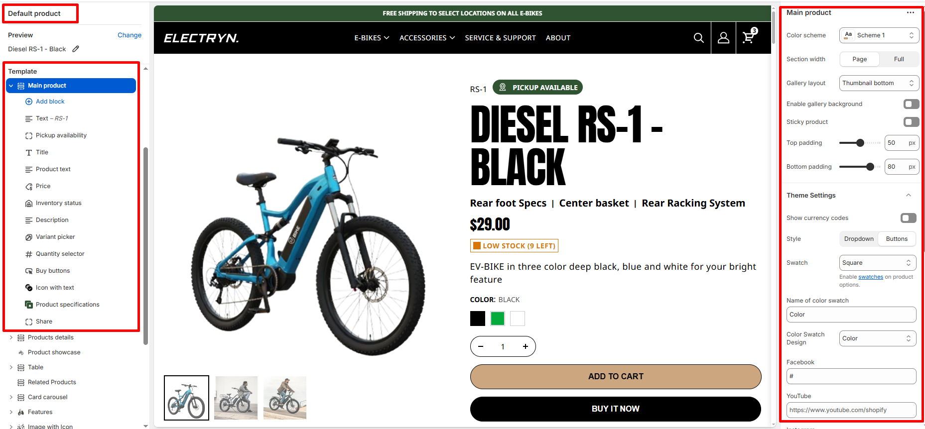
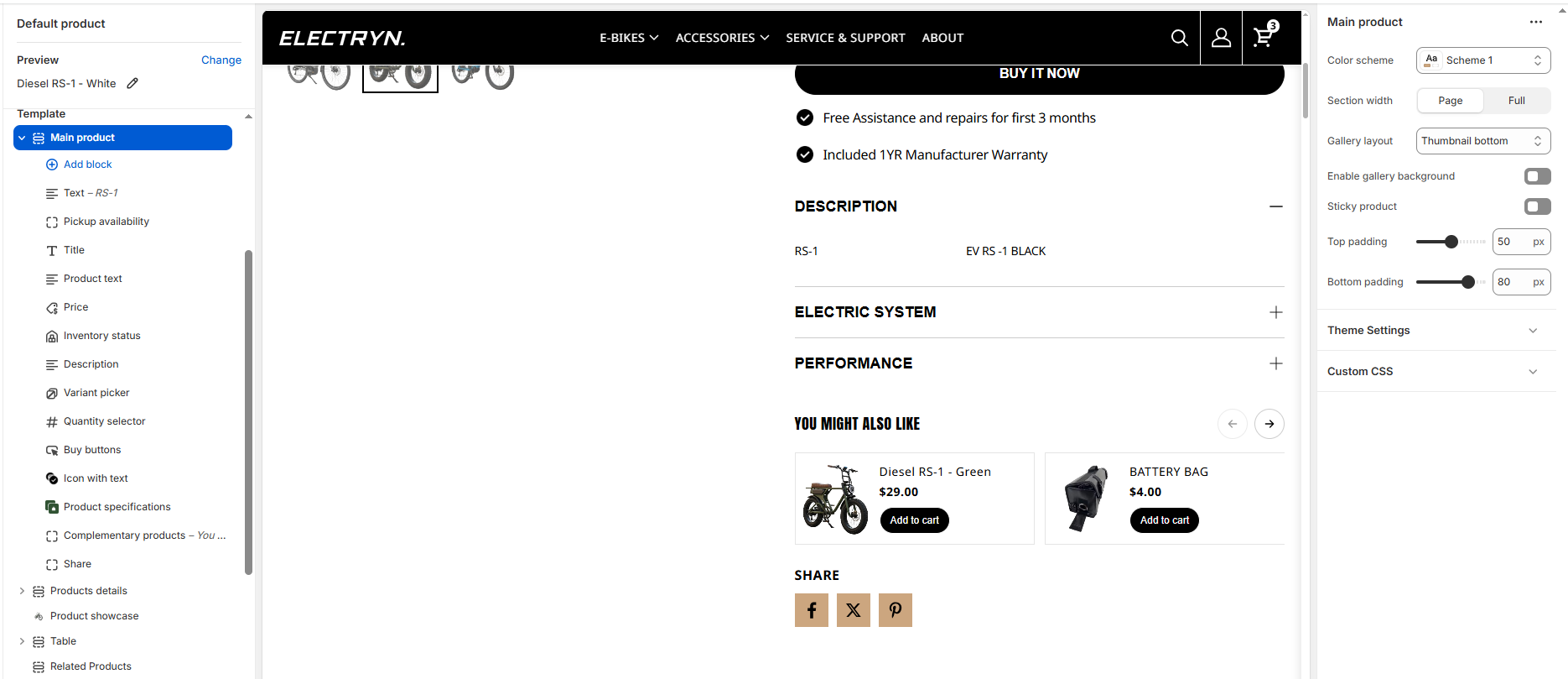
Main Product
This section creates a comprehensive product display page with a customizable layout, media gallery, and product information blocks.
Color scheme
Select color system for background, text and button color.
Section width
Choose how wide the section spans on the page:
-
- Page – aligns with the site’s content width.
- Full – stretches across the full viewport width.
- Narrow: Centered, compact layout (recommended for better readability).
Gallery layout
Select media layout here is four layouts option.
-
- Thumbnail Bottom
- Grid
- Thumbnail Left
- Slideshow
Sticky product
Keeps product information (title, price, buy buttons, etc.) fixed while scrolling on desktop screens.
Enable gallery background
Adds a background behind the product info area for better contrast.
Top padding / Bottom padding
Adjusts the spacing above and below the section.
Block settings
It has the following types of blocks:
Text
Enter any additional text to display in this product section. To display dynamic data, like product Title or Vendor, select the Insert dynamic source icon shown next to the Text box and select any metafield to add here. for more understanding, refer to Metafields.
Title
It displays the selected product’s title inside the product section. It has no customizable block settings available.
Description
It displays a product’s description inside the product section. It has no customizable block settings available.
Price
It displays a product’s price inside the product section.
Quantity selector
It displays a quantity selector, inside the featured product section, for choosing the number of products to purchase. It has no customizable block settings available.
-
- Low inventory threshold: 10
Set to 0 to always display as “In stock” if available. -
Show inventory count: Hide/Show
- Low inventory threshold: 10
Variant picker
Displays a variant picker for selecting variants of a product inside the product section. It has no customizable block settings available.
Please refer to Theme settings > Product for the different variants styles (Dropdown and Color swatches).
Buy buttons
It shows the Add to cart buttons in the product section. and also there is option for Show dynamic checkout buttons hide and show.
Pickup availability
Making your shopping even easier! Now, you can choose the pickup option for your orders.
Inventory status
Displays stock availability (e.g., “In Stock”, “2 left”).
Icon with text
The Icon with Text block lets merchants display small, visual highlights about the product — such as shipping info, return policy, sustainability badges, or product guarantees.
It helps build customer trust and communicates key selling points directly under the product information area.
This block supports multiple icon-text pairs, with the option to arrange them horizontally (side-by-side) or vertically (stacked).
Icon and text items
Each icon-text pair includes two editable fields:
Icon
Upload an image icon (e.g., PNG, SVG, or JPG) representing the feature.
Transparent PNG or monochrome SVG icons work best for visual consistency.
Text
Enter a short, descriptive label for the icon.
Product text
Enter any additional text to display in this product section. To display dynamic data, like product details.
Custom liquid
Add your own content (rich text or HTML) if the content source is set to Custom content.
Complementary products
To select complementary products, add the Search & Discovery app. Learn more
-
- Maximum products to show: Choose how many products show. The minimum number is 1 products and the maximum is 10.
Accordions / Product specifications
This block to include a Heading, Description, Link, and Page content in an interactive container.
Share
Displays share icon buttons for customers to share the product link via social platforms.