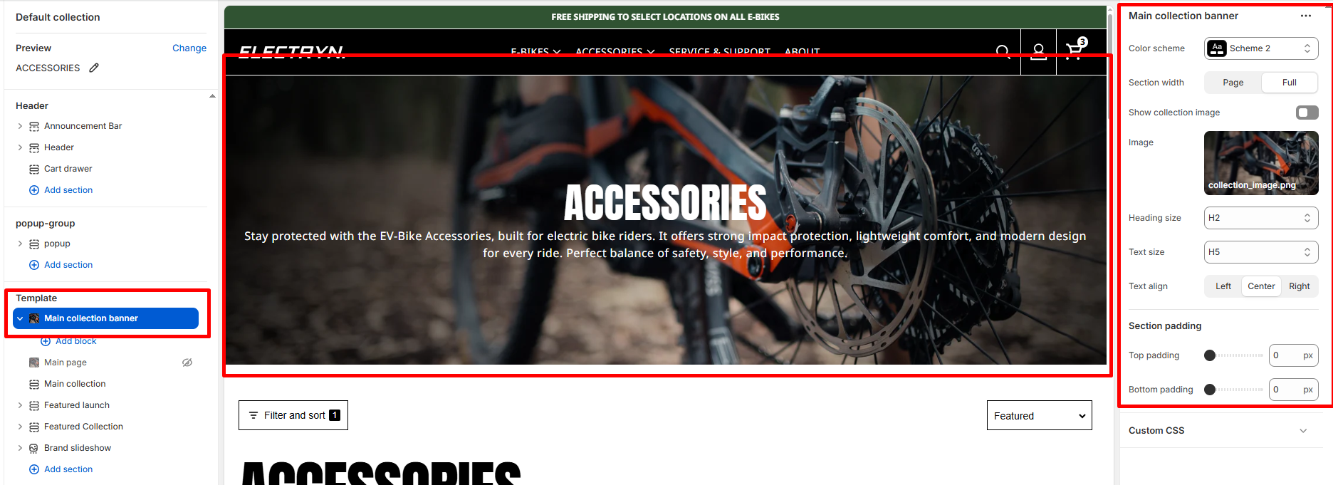
Main Collection Banner
The Main Collection Banner section appears at the top of the collection listing page (/collections). It is used to introduce all collections with a prominent heading and supporting text.
Color scheme
Allows you to select from available theme color schemes to apply background/text styling.
Show collection image
Toggle ON/OFF to display the featured image of the current collection as the banner background.
Image
Upload or select a custom image to display in the banner. If no image is chosen, the collection’s featured image (if available) will be used by default.
Heading size
Choose the heading tag (H1–H6) for the collection title. Typically set to H2 for consistency across pages.
Text size
Sets the size of the subheading or breadcrumb text. Commonly H5 for secondary text.
Text align
Aligns banner text content (Left, Center, or Right).
Top Padding / Bottom Padding
Adjusts the spacing above and below the section.
Blocks Settings
You can enrich your banner with multiple content blocks to create a compelling visual + textual combo.
Supported Content Blocks:
-
- Breadcrumbs
- Text
- Heading
- Subheading
- Button


