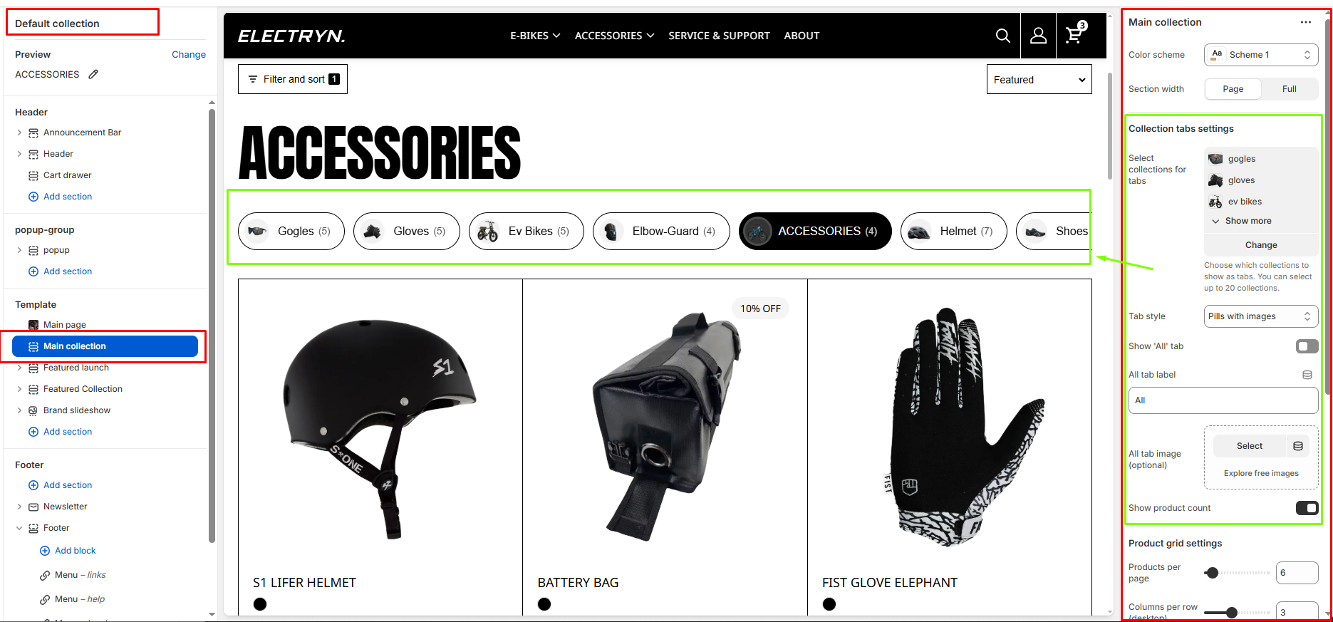
Main collection
This section controls how products are displayed on a collection template page. It includes layout, filtering, and product card settings to tailor the collection browsing experience.
Color scheme
Sets the color scheme (background, text, etc.) for the section.
Section width
Choose how wide the section spans on the page:
-
- Page – aligns with the site’s content width.
- Full – stretches across the full viewport width.
Collection tabs settings
Select collections for tabs
Choose which collections to show as tabs. You can select up to 20 collections. like (“bike”, “accessories”)
Tab style
Select the visual style for collection tabs. Options include pills with images or other available styles.
-
- Simple pills – only pills type tab show .
- Pills with image – tab show pills type with image.
- Minimal underline – only tag show with underline.
Show ‘All’ tab
When enabled, displays an “All” tab that shows products from all selected collections.
All tab label
Customize the text label for the “All” tab.
All tab image (optional)
Upload an optional image to display with the “All” tab.
Show product count
When enabled, displays the number of products in each collection tab next to the collection name.
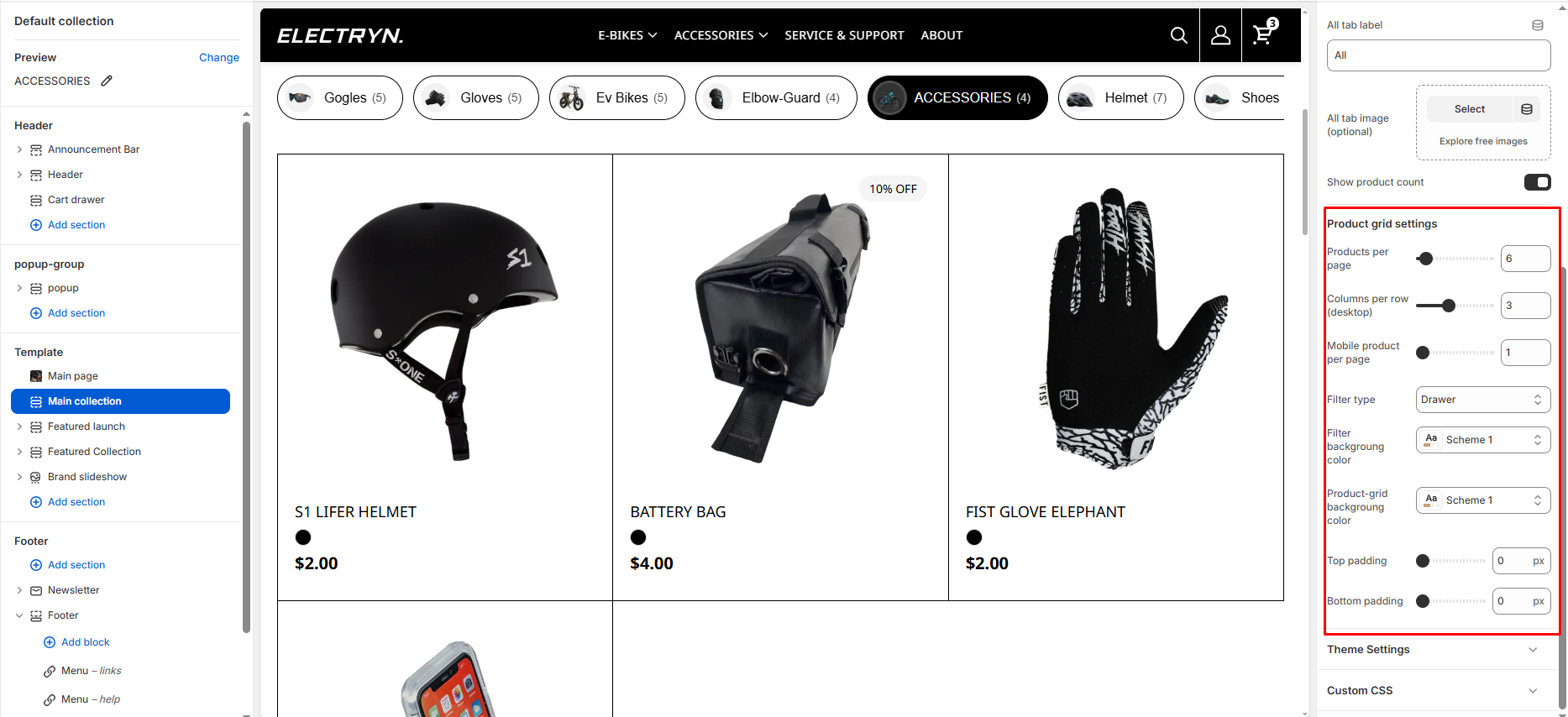
Product grid settings
Products per page
Set the number of products to display on each page of the collection.
Columns per row (desktop)
Choose how many product columns to display in each row on desktop screens.
Mobile product per page
Set the number of product columns to display per row on mobile devices.
Filter type
Controls filter layout:
-
- Vertical: Sidebar
- Horizontal: Top bar
- Drawer: Mobile-style drawer
Filter background color
Choose the background color scheme for the filter area.
Product-grid background color
Set the background color scheme for the product grid area.
Top Padding / Bottom Padding
Adjusts the spacing above and below the section.