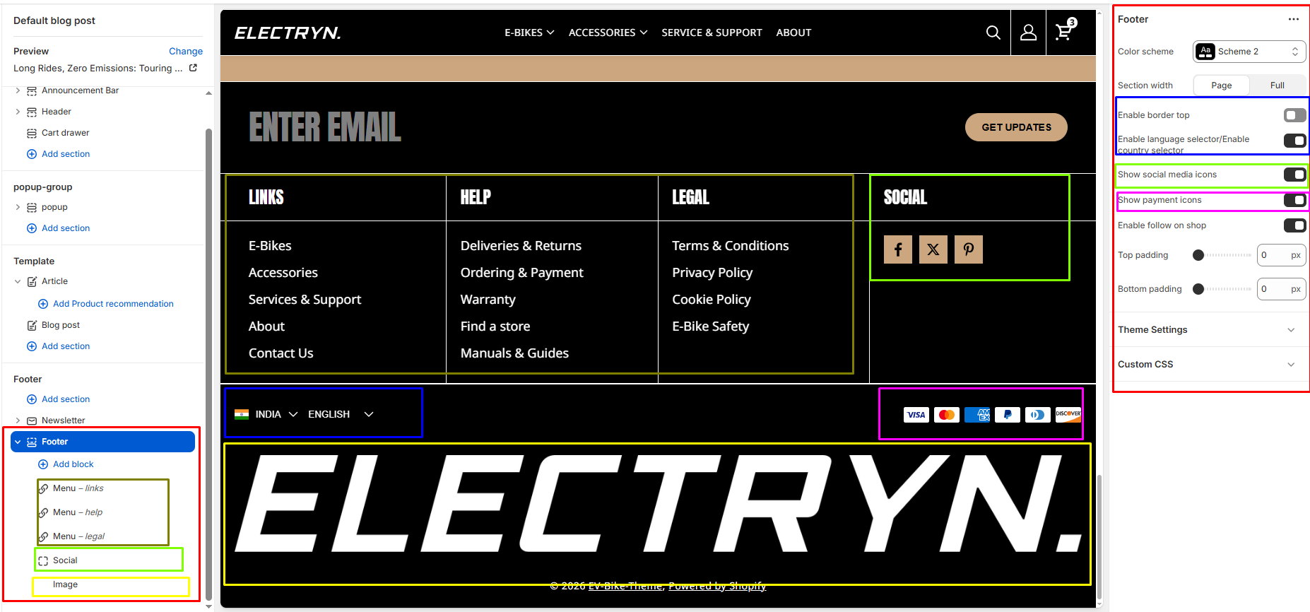
Footer
The footer appears at the bottom of every page. You can customize it to fit your brand and product offerings.
Color scheme
Choose background and text colors for your store footer.
Padding
You can add padding in customization.
Bottom footer
A storefront’s bottom footer contains the information listed at the bottom of a footer. Often the bottom footer is the area where customers expect to find broad links, like a sort of information desk.
-
- Show social media icons: Select/deselect to show/hide the social icons.
- Enable language selector/Enable country selector : Select/deselect to show/hide the currency/country.
- Show payment icons: Select/deselect to show/hide the payment enable.
- Enable follow on shop: Select/deselect to show/hide the enable follow-on shop.
- Enable border top: Select/deselect to show/hide the top border.
Text
To add Text for brand information, choose the “Add block” option on your store. Inside the text block, display an area containing a formatted Heading, Subtext.
Heading Size
-
-
Options:
H1,H2,H3,H4,H5,H6 -
Description:
Sets the size of the Heading. Use larger sizes (e.g., H2–H3) for prominent messages, smaller sizes (e.g., H5–H6) for subtle notes.
-
Text Size
-
-
Options:
H1,H2,H3,H4,H5,H6 -
Description:
Sets the size of the Subtext. Use larger sizes (e.g., H2–H3) for prominent messages, smaller sizes (e.g., H5–H6) for subtle notes.
-
Social
Display a Social media icons and add custom heading.
Menu
Choose “Add block” on your store to add a footer menu.
-
- Show menu title
Enable/Disable menu title.
-
- Menu title
Add a custom heading. If the heading input is left blank, display the default menu title instead.
Image
Add an image block, set the image size, and also add a link to the image.
Newsletter
Display a newsletter sign-up form with customizable heading and text.


