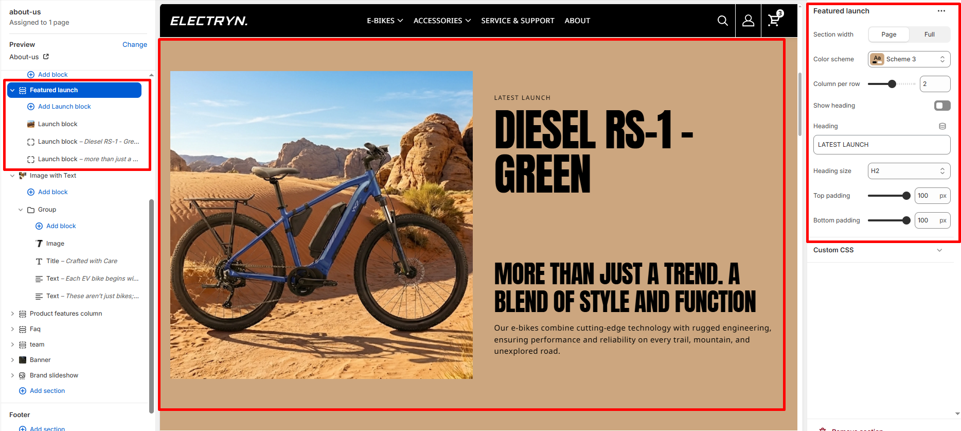
Featured Launch
A Featured Launch section showcases new product launches or featured content in a flexible grid layout. This section is ideal for highlighting new products, special collections, or promotional content with rich imagery and compelling text. Each launch card can be customized with images, headings, descriptions, and call-to-action buttons, creating an engaging presentation for visitors.
Color scheme
Select the color scheme from your theme’s available options to match your brand style.
Heading
Enter text to display as a heading.
Heading Size
Adjusts the size of the heading in dropdown (H1 to H6).
Column per row
Adjust the number of launch blocks displayed per row on desktop devices using a slider control. Range: 1-3 columns. Default value is 2 columns.
Show heading
Enable or disable the section heading display. Toggle this checkbox to show or hide the main heading.
Top padding
Adds space above the section (in pixels).
Bottom padding
Adds space below the section (in pixels).
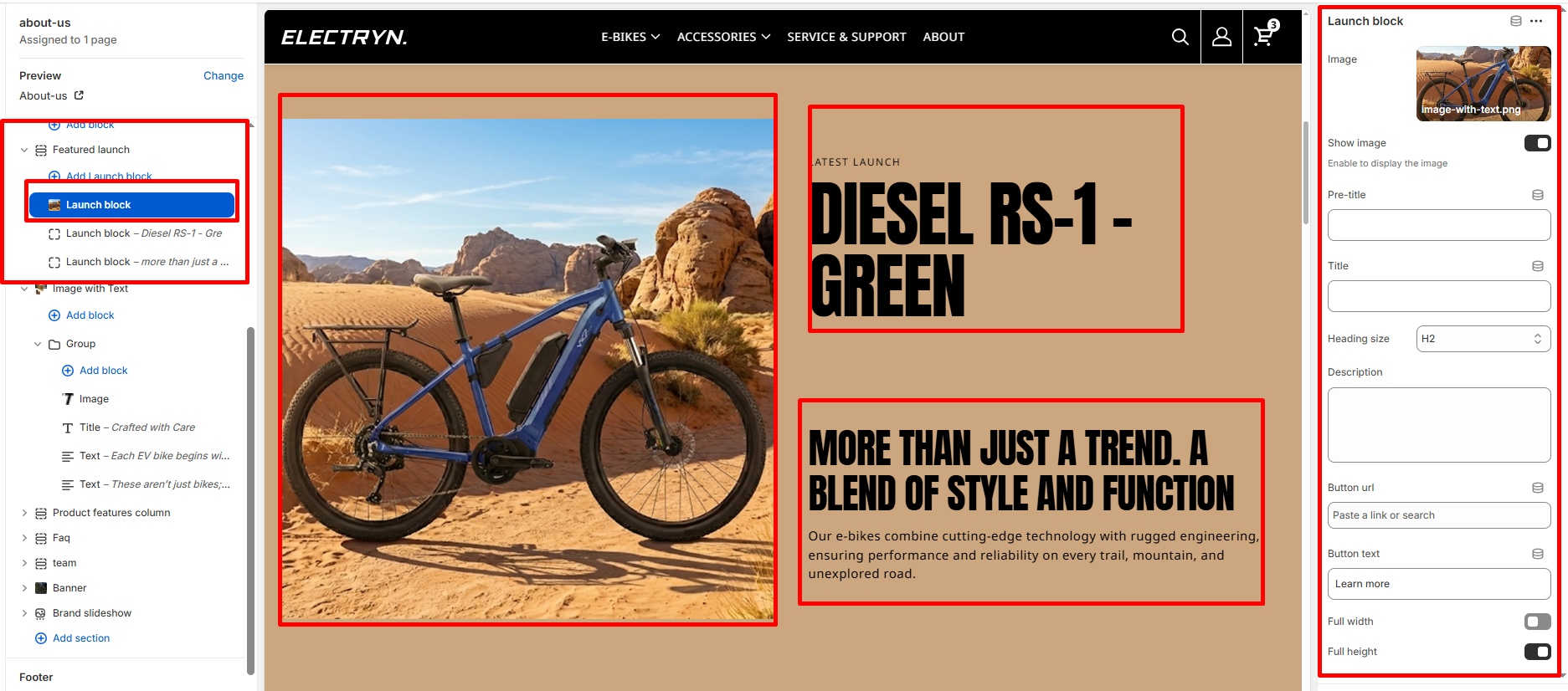
Theme blocks – Launch block
Add multiple launch blocks to create a grid of featured content. Maximum of 12 blocks can be added. Each launch block includes:
Image
Upload or select an image for the launch card.
Show image
Enable or disable the image display. Toggle this checkbox to show or hide the image. When enabled, the image will be displayed on the card.
Pre-title
Enter a small text label that appears above the main title.
Title
Enter the main title for the launch card.
Heading size
Adjusts the size of the heading in dropdown (H1 to H6).
Description
Add detailed descriptive text about the product or launch using a textarea field.
Button url
Paste a link or search for a page/product to link the button to.
Button text
Enter the button label text (e.g., “Learn more”).
Full width
Enable this checkbox to make the launch card span the full width of the grid, creating a featured spotlight effect.
Full height
Enable this checkbox to make the launch card expand to full height, ensuring consistent card heights across the grid.