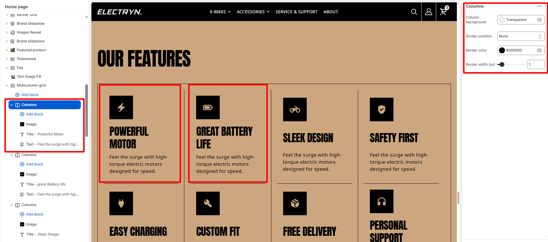
Column / Columns
The Column block is used within the Multicolumn section to create individual feature cards that include an image, title, text, and optional background styling. Each column allows you to highlight key brand values, features, or services in a consistent layout.
Block Settings
Image
Upload an image that visually represents the column’s content (e.g., product ingredient, lifestyle photo, or illustration).
Title
Add a short, bold heading to describe the feature (e.g., Pure Ingredients, Sustainable Beauty).
Text
Add a supporting paragraph to elaborate on the feature or value.
Column Background
Choose a custom background color for the column card. This helps visually differentiate columns or match them with your theme’s palette.
Border
Choose a custom border for the column card.