Announcement bar
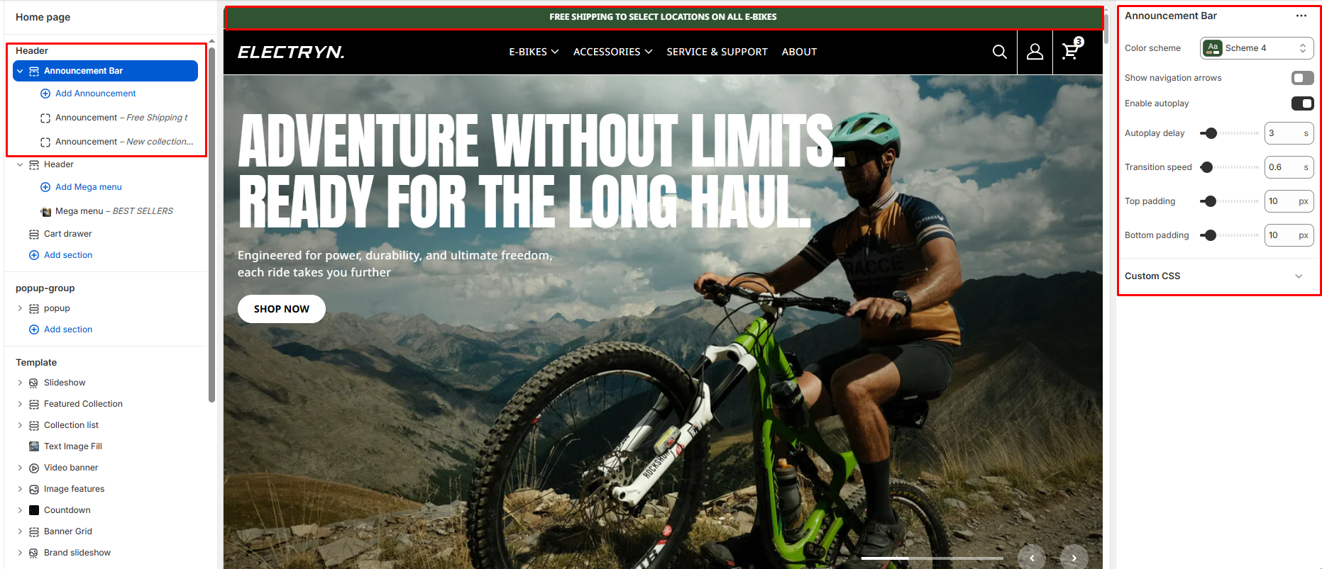
The Announcement Bar section allows you to display rotating or static messages at the top of your store. This is useful for sharing important announcements, promotions, shipping updates, or seasonal messages.
Color scheme
Choose background and text colors for your announcement bar. Use a blank value for transparency.
Show Navigation Arrows
Toggle to show or hide left and right navigation arrows on the slider. When enabled, users can manually navigate between slides.
Enable Autoplay
Enables automatic sliding between multiple announcement blocks.
-
-
When Enabled:
-
Uses the Change every and Slider speed settings.
-
-
When Disabled:
-
Only the first announcement block is shown.
-
-
Autoplay Delay
Controls the time (in milliseconds) between automatic slide transitions when autoplay is enabled.
Transition Speed
Adjusts the duration (in milliseconds) of the slide transition animation.
Top Padding
Adds vertical spacing above the announcement content for layout customization.
Bottom Padding
Adds vertical spacing below the announcement content.
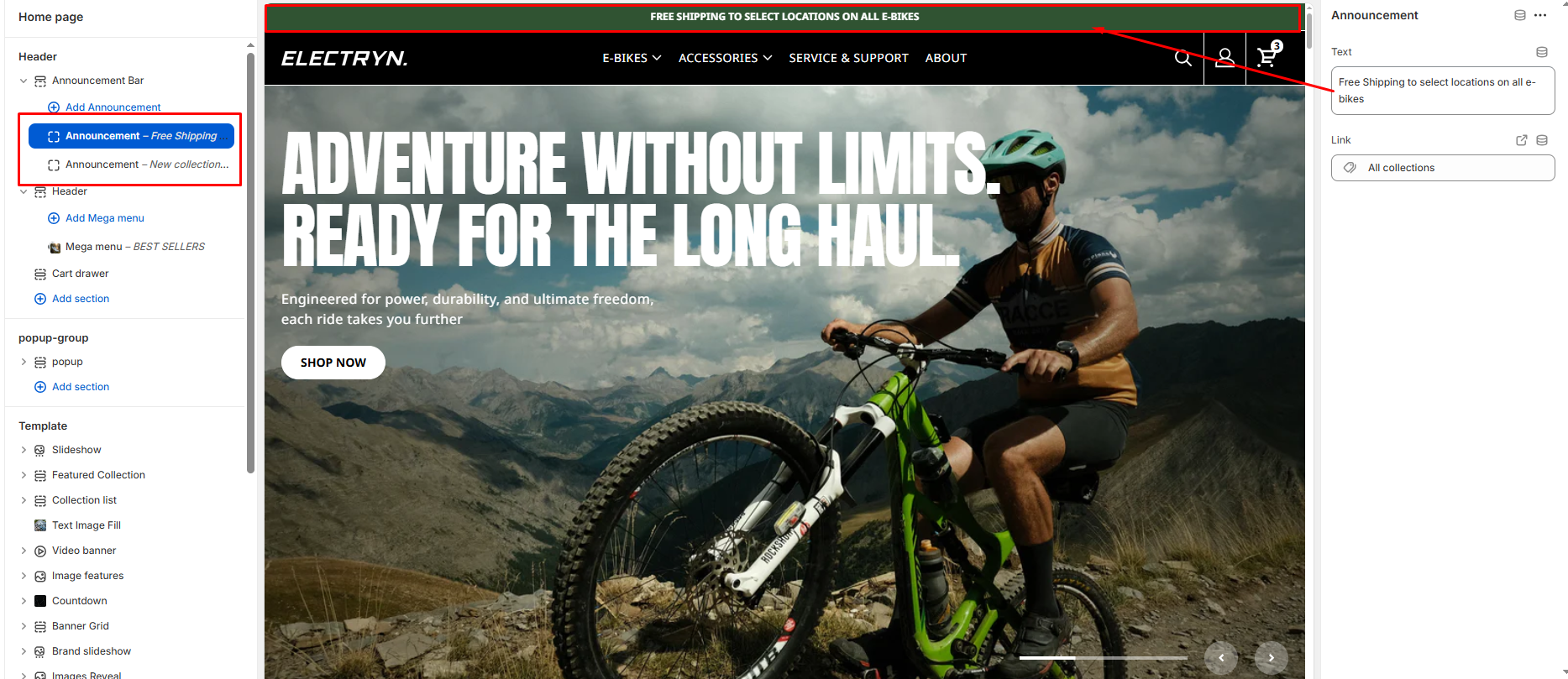
Announcement Block
Each Announcement Block in the Announcement Bar allows you to add a single line of promotional or informational content with an optional link. These blocks are especially useful when combined with the auto-rotate feature.
Text
The main announcement message shown in the bar. Use concise text to highlight offers, shipping info, events, or social proof.
Link URL
Destination URL for the link label. You can select from internal links (like All Collections, Products, Pages) or enter a custom URL.