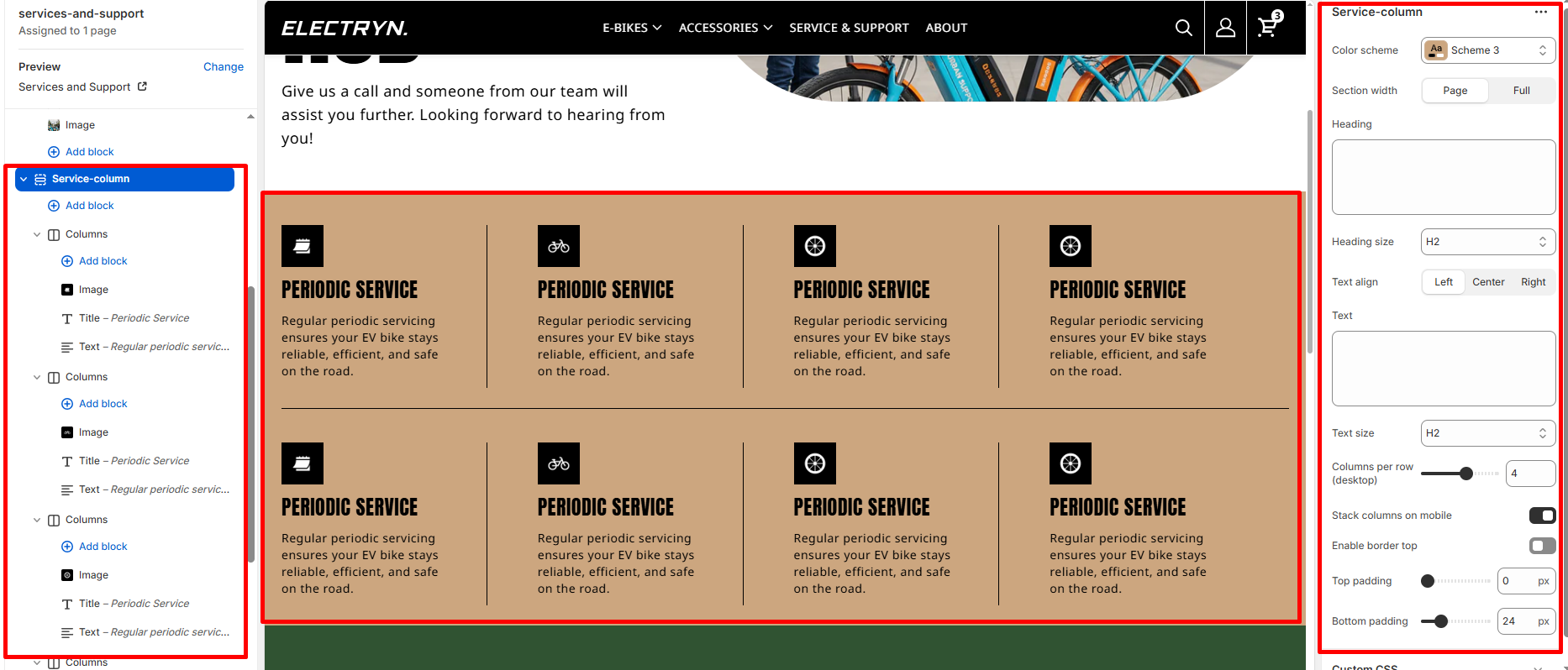
Service Column
A Service Column section displays service offerings in a structured grid layout with icons, titles, and descriptions. This section is designed to showcase multiple service categories, support options, or product features in an organized format. Each service column includes an icon and descriptive text to clearly communicate the service details to visitors.
Color scheme
Select the color scheme from your theme’s available options to match your brand style.
Section width
Choose how wide the section spans on the page:
-
- Page – aligns with the site’s content width.
- Full – stretches across the full viewport width.
Heading
Main heading/title of the section.
Heading size
Choose the size for the heading.
Text
Optional description or intro text under the heading.
Text size
Choose the size for the body text.
Text align
Align all text in the section: Left, Center, or Right.
Columns per row (desktop)
Select how many columns to display per row on larger screens (e.g., 2, 3, 4).
Stack columns on mobile
Enable to stack columns vertically on smaller screens for better mobile readability.
Top padding
Adds space above the section (in pixels).
Bottom padding
Adds space below the section (in pixels).
Theme blocks
You can add the following theme blocks inside each column:
-
- Image block – Add images to your columns
- Title block – Add headings within columns
- Text block – Include descriptive text or content
- Button block – Add call-to-action buttons
- And other available blocks