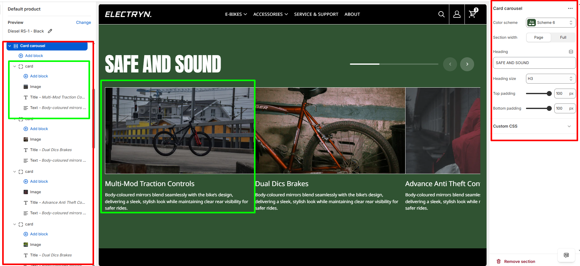
Card Carousel
The Card Carousel section displays content cards in a slideshow format with navigation controls and progress bar.
Color scheme
Select the color scheme from your theme’s available options to match your brand style.
Section width
-
- Page – aligns with the site’s content width.
- Full – stretches across the full viewport width.
Heading
Enter text to display as a heading.
Heading size
Allows choosing Title hierarchy (e.g., H1 To H6).
Top padding
Adds space above the section (in pixels).
Bottom padding
Adds space below the section (in pixels).
Blocks – Card
You can add the following theme blocks inside each Card :
-
- Image block – Add images to your card.
- Title block – Add headings within card.
- Text block – Include descriptive text or content.