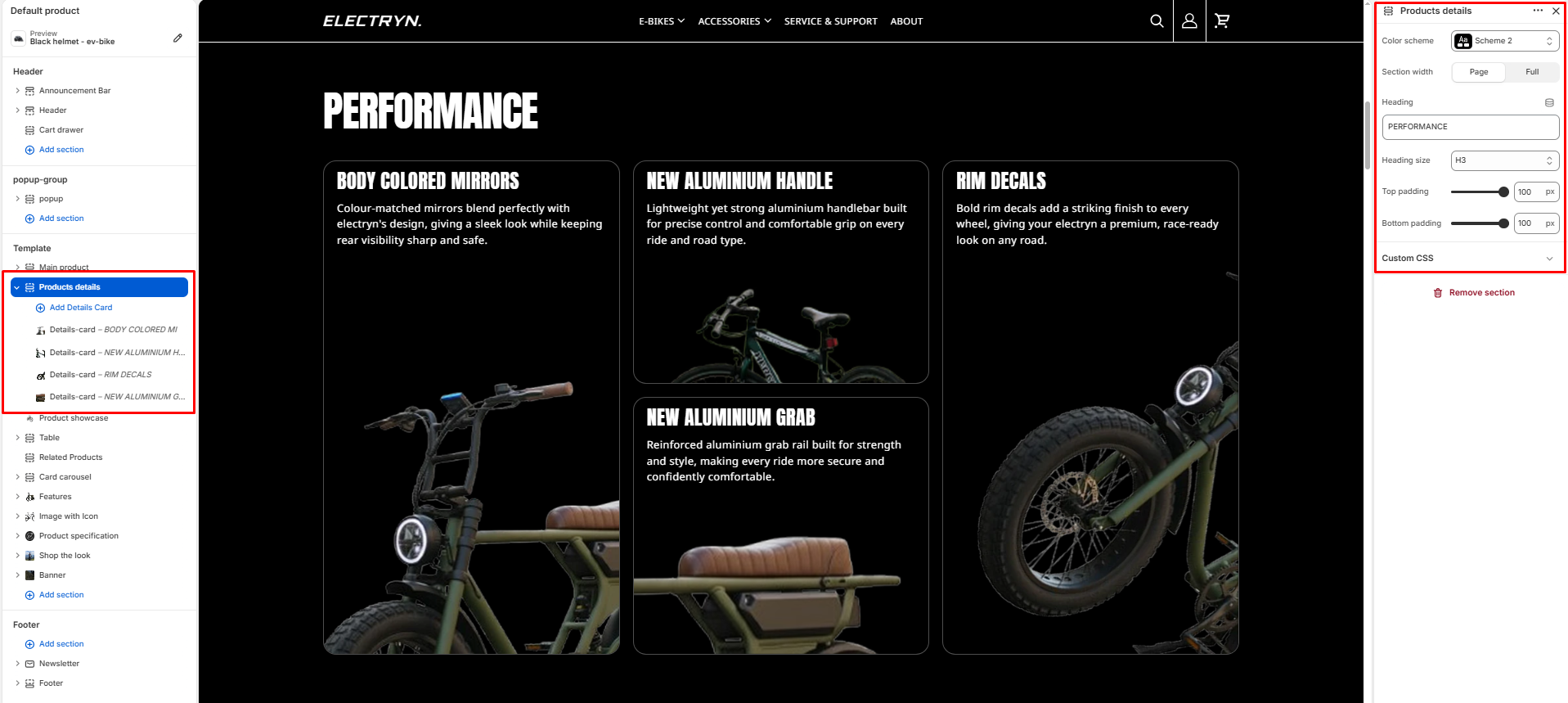
Products Details
The products details section displays product features and specifications in a card-based layout.
Color scheme
Select the color scheme from your theme’s available options to match your brand style.
Section width
-
- Page – aligns with the site’s content width.
- Full – stretches across the full viewport width.
Heading
Enter text to display as a heading.
Heading Size
Allows choosing Heading hierarchy (e.g., H1 To H6).
Top padding
Adds space above the section (in pixels).
Bottom padding
Adds space below the section (in pixels).
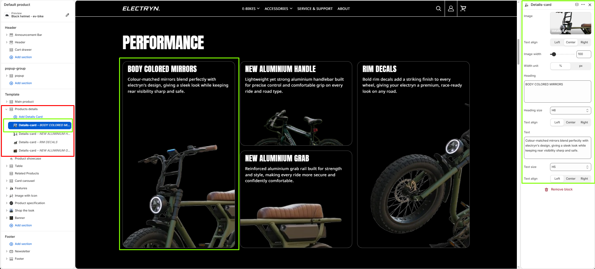
Block – Details-card
-
- Details-card block – Add individual product detail cards
Each Details-card can contain:
-
- Heading block – Add a title for the product feature
- Text block – Include descriptive text about the feature
- Image block – Add an image showcasing the product detail