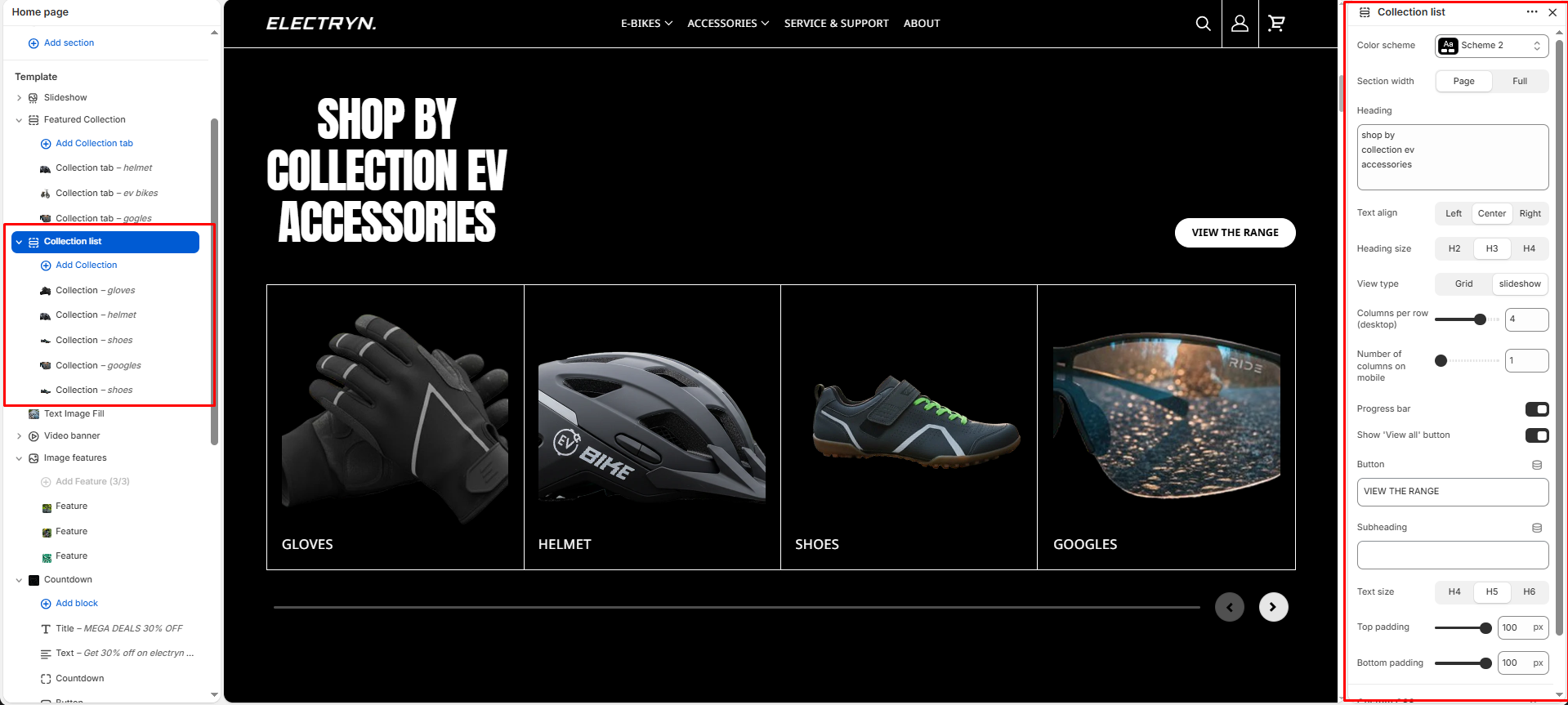
Collection list
This section displays collections in a customizable grid or slider layout, allowing you to showcase multiple collections with images and descriptions.
Color scheme
Select a color scheme defined in your theme. This controls the background and text color of the entire section.
Section width
Choose how wide the section spans on the page:
-
- Page – aligns with the site’s content width.
- Full – stretches across the full viewport width.
Heading
Add a heading text for the section.
Heading size
Choose heading size (H1–H6) for the section heading.
Display type
Choose layout style: Grid or Slider.
Columns per row (desktop)
Select how many columns to display per row on larger screens.
Number of columns on mobile
Select how many columns to display per row on mobile screens.
Progress bar
Enable this option to display a progress indicator bar below the slider. The progress bar fills from left to right as you navigate through collection.
Show ‘View all’ button
Toggle to show or hide a button linking to the full collection page.
Top padding
Adjust spacing above the section (in pixels).
Bottom padding
Adjust spacing below the section (in pixels).
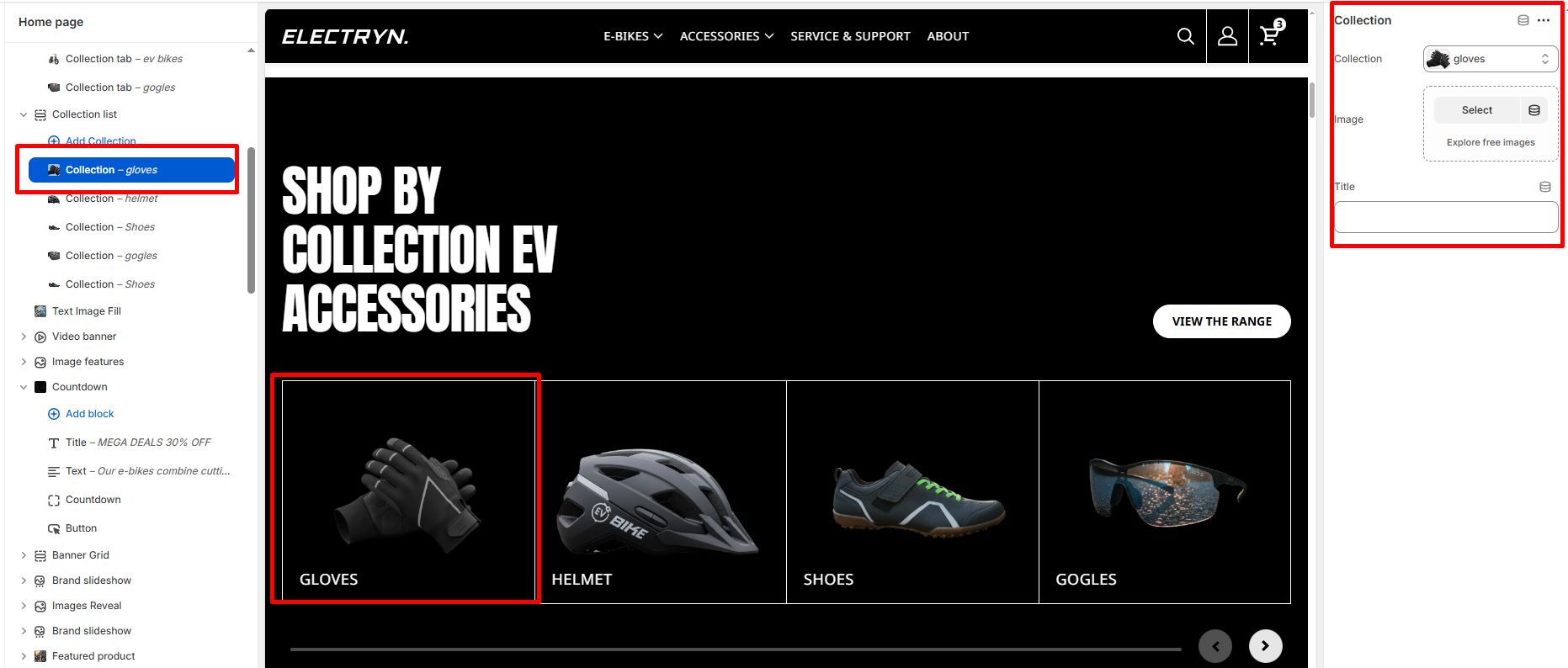
Block – Collection
The collection block displays products from a selected collection in a grid layout.
Collection
Select the collection you want to display products from.
Image
Upload a custom image to represent the collection. If left blank, the default collection image will be used.
Title
Enter the title text for the collection. If left blank, the collection’s default title will be displayed.