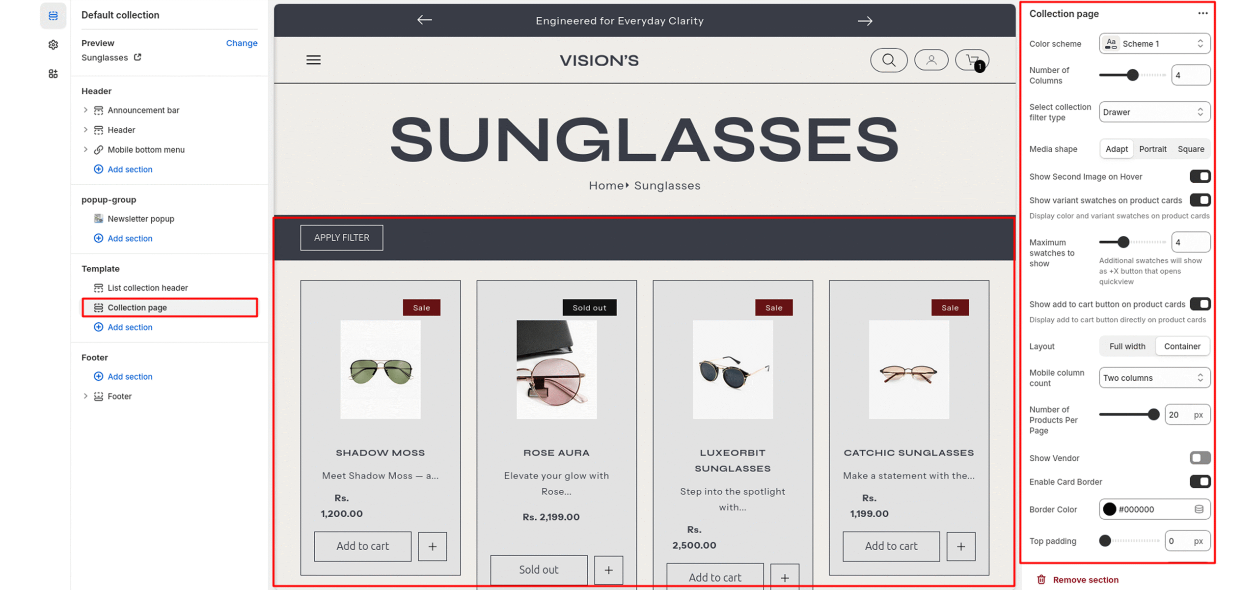
Collection
This section controls how products are displayed on a collection template page. It includes layout, filtering, and product card settings to tailor the collection browsing experience.
Color scheme
Sets the color scheme (background, text, etc.) for the section.
Number of Columns
Sets the number of product columns on desktop view.
Select Collection Filter Type
Controls filter layout:
- Vertical: Sidebar
- Horizontal: Top bar
- Drawer: Mobile-style drawer
Media Shape
Controls aspect ratio of product images.
- Adapt : Based on image.
- Portrait : Taller.
- Square : 1:1 ratio.
Show Second Image on Hover
Shows alternate image when user hovers on a product card.
Show Variant Swatches on Product Cards
Displays color/variant swatches under product image (if available).
Maximum Swatches to Show
Sets max visible swatches before switching to “+X more” indicator.
Show Add to Cart Button on Product Cards
Enables direct “Add to Cart” buttons under each product card.
Layout
Determines overall content width.
-
Full Width
- Container
Mobile Column Count
Sets how many product columns show on mobile devices.
Number of Products Per Page
Sets how many products to display before pagination kicks in.
Show Vendor
Displays product vendor/brand below product title.
Enable Card Border
Adds a visible border around each product card.
Border Color
Color picker or hex input.
Top Padding / Bottom Padding
Adjusts the spacing above and below the section.