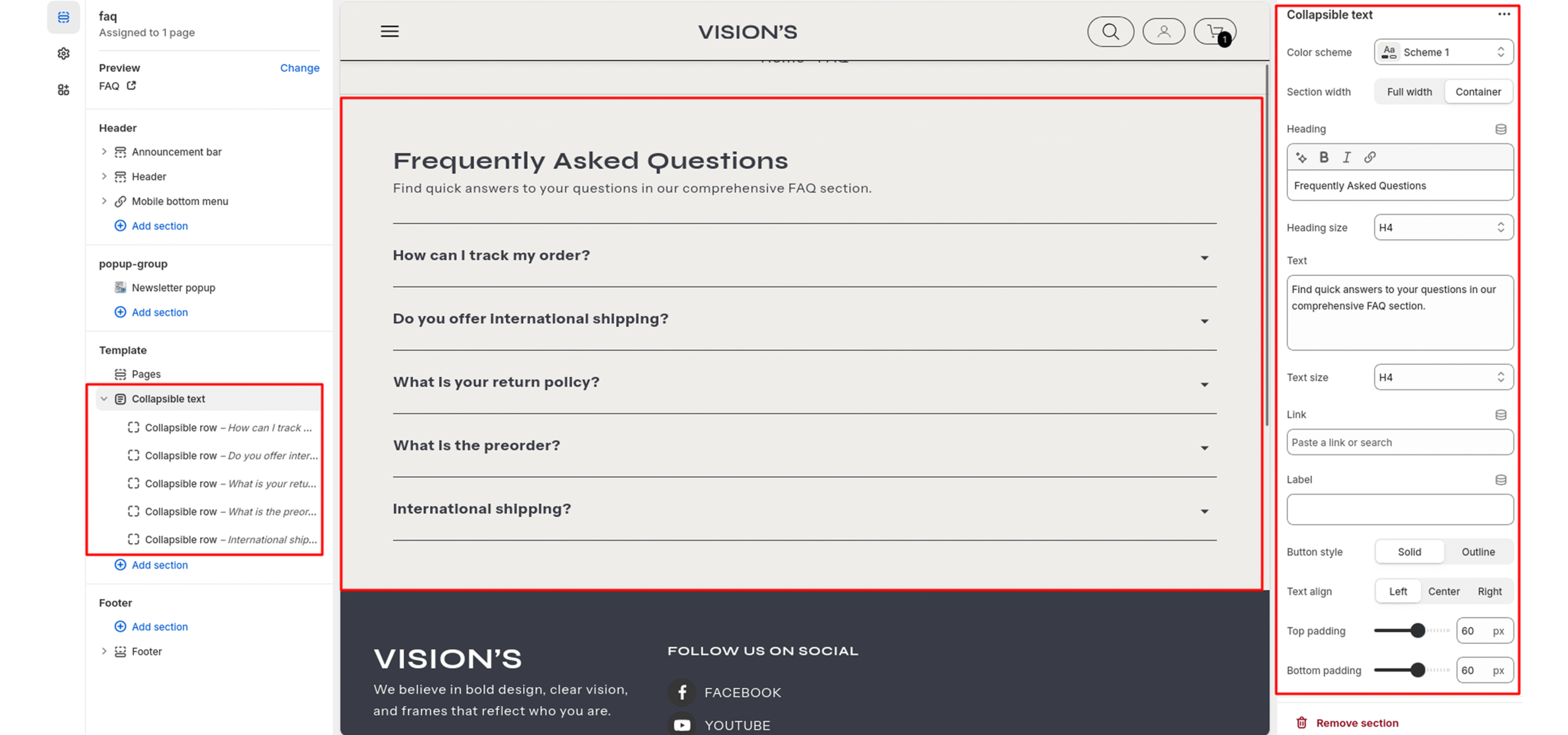
Collapsible Text
The FAQ (frequently asked questions) section displays common questions and answers from customers using a dynamic, accordion-style layout.
Color system
Select a color scheme defined in your theme. This controls the background and text color of the entire section.
Section width
-
Full Width – Spans the entire screen width.
-
Container – Keeps the content within a centered content container.
Heading
Enter text to display as a heading.
Heading Size
Adjusts the size of the heading in dropdown (H1 to H6).
Text
In the Text box, enter the description.
Text Size
Allows choosing Text hierarchy (e.g., H1 To H6).
Button label
Filling this in will display a button label.
Link
Select links or pages for the button.
Button Style
- Solid: The button will have a filled background.
- Outline: The button will have a transparent background with a border and text.
Text Align
This setting determines the horizontal alignment of text within the section. It gives the merchant control over how content such as headings, descriptions, or buttons are positioned, enabling better alignment with their store’s design and layout preferences.
- Left: Aligns all text to the left.
- Center: Centers the text horizontally.
- Right: Aligns all text to the right.
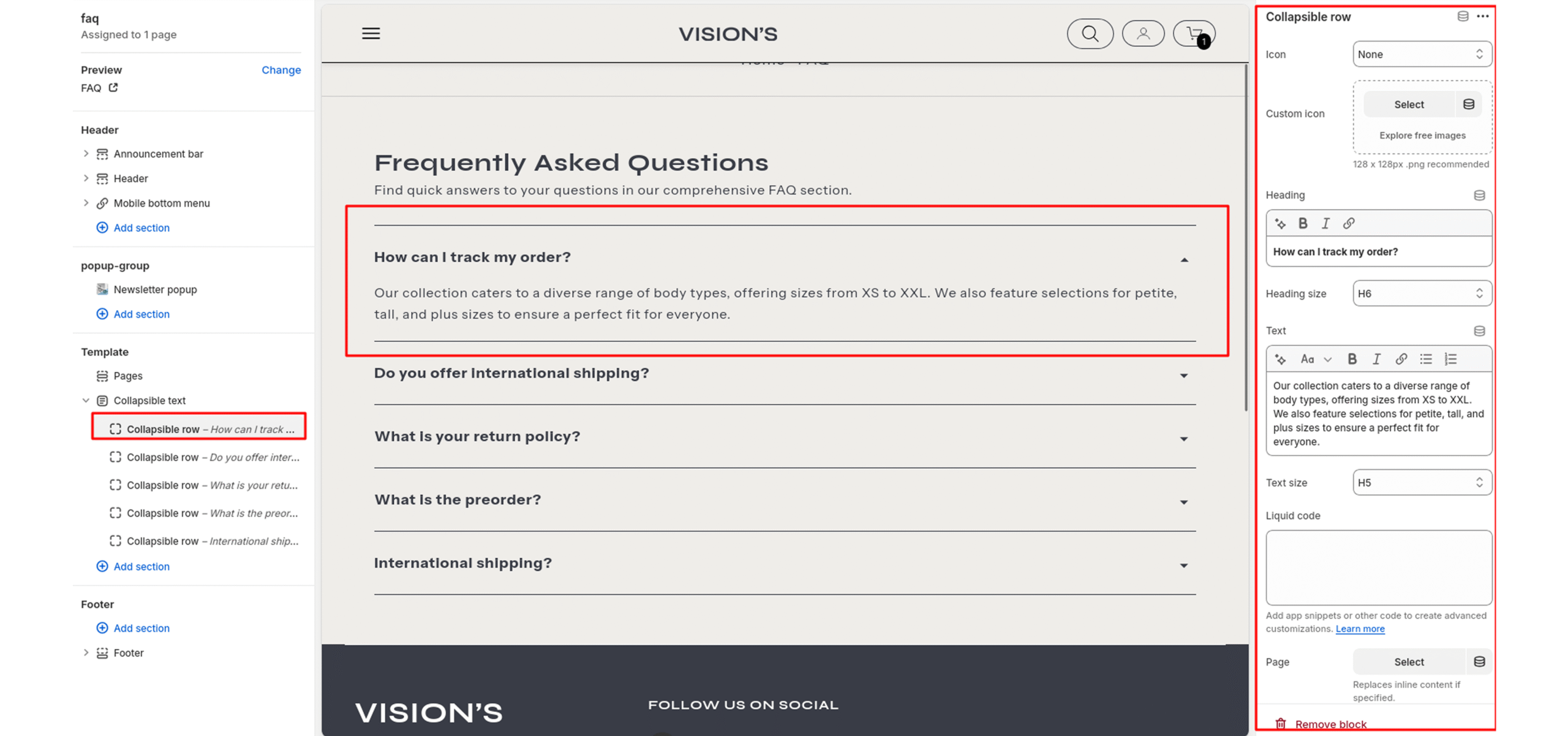
Blocks – Collapsible row
Icon
Select icon for showing before row.
Custom icon
Add image for showing custom icon.
Heading
In the Heading, enter text to display as a question inside the block.
Heading Size
Adjusts the size of the heading in dropdown (H1 to H6).
Text
In the Text, enter text to display as an answer inside the block. Format the text and add links using the text editor.
Text Size
Allows choosing Text hierarchy (e.g., H1 To H6).
Liquid code
Add content if you want any html or something other.
Page
Select page if you want add page in collapsible content.