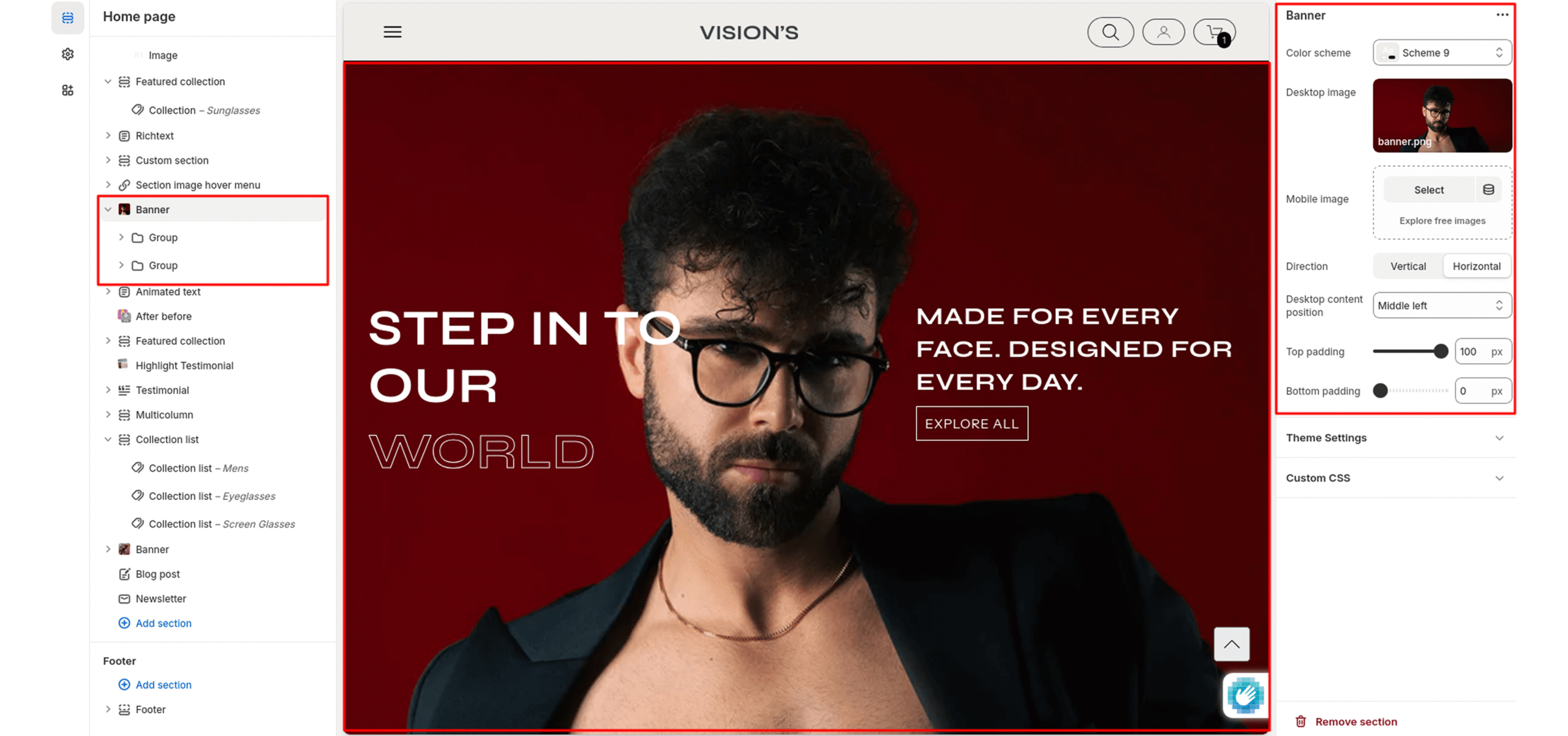
Banner
The banner section supports two different images for desktop and mobile.
Color system
Select a color system for background, text, and button color.
Desktop image
Select an image to show in the desktop view.
Mobile image
Select an image to show in the mobile view.
Direction
Controls the layout flow of items inside the section.
You can choose how the content (such as text, images, or blocks) is arranged within the container.
-
Horizontal
Items are arranged side by side in a row (left to right).
Useful for carousels, side‑by‑side product features, or any layout where content should be aligned horizontally. -
Vertical
Items are stacked on top of each other in a column (top to bottom).
Useful for lists, stacked testimonials, or mobile-friendly single-column layouts.
Desktop content position
Select the most relevant area of the image for the content position on the desktop. Its options include:
- Top left
- Top center
- Top right
- Center left
- Center
- Center right
- Bottom left
- Bottom center
- Bottom right
Top Padding
Set top spacing in pixels.
Bottom Padding
Set bottom spacing in pixels.