Main collection list
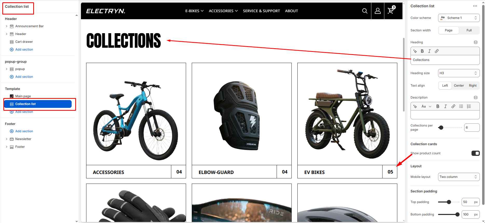
The Main Collection List section is used to visually display multiple collections in a grid format on the collection listing page. Each collection appears as a card with an image and title.
Color scheme
Allows you to select from available theme color schemes to apply background/text styling.
Section width
Choose how wide the section spans on the page:
-
- Page – aligns with the site’s content width.
- Full – stretches across the full viewport width.
Section heading
Enter a heading to introduce the collection list.
Heading size
Select the text size for the heading (e.g., H1, H2, H3, H4, H5, H6).
Section description
Enter a description to introduce the collection list.
Collections per page
Select how many collection cards appear per row on desktop view.
Show product count
Toggles whether to display the total number of products within each collection (e.g., “09”).
Mobile layout
Controls how collection cards appear on mobile screens:
-
- Single column: Displays one collection card per row (large visual focus).
- Double column: Displays two smaller collection cards per row (more compact view).
Top Padding / Bottom Padding
Adjusts the spacing above and below the section.